How to Setup Multiple Themes in NextJS with React-Bootstrap

Jasser Mark Arioste

Hello, hustlers! In my previous tutorial, we learned how to add react-bootstrap to NextJS. If you don't know how to add react-bootstrap to NextJS yet, I suggest taking a look at the previous tutorial.
In this tutorial, you'll learn how to set up multiple custom themes for react-bootstrap in a NextJS Project.
To be honest, I'm not sure if this is the best practice for setting up multiple themes in react-bootstrap but this is the simplest solution I can think of. If you have a better way of doing this please contact me through GitHub!
Here's an outline of what we will be doing in this tutorial:
- Create custom themes in
/stylesfolder using.scssfiles - Generate the CSS files using
sasscli. Step can probably be improved but it's beyond the scope of this tutorial. - Implement a
BootstrapThemeContextProviderto easily switch theme across the entire application. - Use a custom
useThemeshook to easily change the themes
Step 1: Creating Custom Themes #
First step is create create custom themes for bootstrap. Create two files styles/custom.scss and styles/main.scss.
styles/main.css:
This will be our main theme which uses the default bootstrap theme with no modifications.
@import "../node_modules/bootstrap/scss/bootstrap";1
styles/custom.scss:
// styles/custom.scss $primary: #2416a0; $danger: #ff4136; @import "../node_modules/bootstrap/scss/bootstrap";1234
Step 2: Adding Scripts to Generate the CSS #
The next step is to generate these custom .scss files in the public/styles folder. To do that, let's modify our package.json file a bit. Add the highlighted scripts to your package.json
{
  ...
  "scripts": {
    "dev": "next dev",
    "build-themes": "sass styles:public/styles --no-source-map --style=compressed",
    "prebuild": "npm run build-themes",
    "build": "next build",
    "start": "next start",
    "lint": "next lint"
  },
  ...
}123456789101112
Now, if you run npm run build, it will generate main.css and custom.css in the public/styles folder.
└ public
   └ styles
      ├ main.css
      └ custom.css
├ package.json12345
Step 3: Implementing the ThemeProvider #
Let's implement a ThemeProvider component to easily change themes within the application.
First, let's install usehooks-ts to get useful custom hooks such as useLocalStorage. We'll use localStorage to store the theme.
yarn add usehooks-ts1
Next, create the file components/BootstrapThemeProvider.tsx and copy the code below:
// components/BootstrapThemeProvider.tsx import React, { PropsWithChildren, useContext, useEffect } from "react"; import { useLocalStorage } from "usehooks-ts"; // 👇 define a map of all the themes we'll be using in the app const ThemeMap = { main: "/styles/main.css", custom: "/styles/custom.css", cerulean: "https://bootswatch.com/5/cerulean/bootstrap.min.css", cosmo: "https://bootswatch.com/5/cosmo/bootstrap.min.css", }; type ThemeKey = keyof typeof ThemeMap; type ThemeContextState = { theme: ThemeKey; setTheme(theme: ThemeKey): void; }; const ThemeContext = React.createContext<ThemeContextState>({ theme: "main", setTheme: () => {}, }); const BootstrapThemeProvider = (props: PropsWithChildren) => { const [theme, setTheme] = useLocalStorage<ThemeKey>("theme", "main"); // 👇 when the theme changes we'll append a new link element pointing to the css url. useEffect(() => { if (theme) { //create a link element var themesheet = document.createElement("link"); themesheet.href = ThemeMap[theme]; themesheet.id = "theme"; themesheet.rel = "stylesheet"; //remove previous element if any; const prevTheme = document.getElementById("theme"); if (prevTheme) { document.head.removeChild(prevTheme); } //if theme is not "main" we append the link if (theme !== "main") { document.head.append(themesheet); } } }, [theme]); return ( <ThemeContext.Provider value={{ theme, setTheme }}> {props.children} </ThemeContext.Provider> ); }; export default BootstrapThemeProvider; export const useTheme = () => { const context = useContext(ThemeContext); if (!context) { throw new Error("Use <BootstrapThemeProvider> in Parent."); } return context; };123456789101112131415161718192021222324252627282930313233343536373839404142434445464748495051525354555657
Next, let's use the BootstrapThemeProvider component inside _app.tsx. Note that we import ../styles/main.css beforehand to prevent flickering:
// pages/_app.tsx import type { AppProps } from "next/app"; import BootstrapThemeProvider from "../components/BootstrapThemeProvider"; import "../styles/main.scss"; function MyApp({ Component, pageProps }: AppProps) { return ( <BootstrapThemeProvider> <Component {...pageProps} /> </BootstrapThemeProvider> ); } export default MyApp;123456789101112
Step 4: Usage #
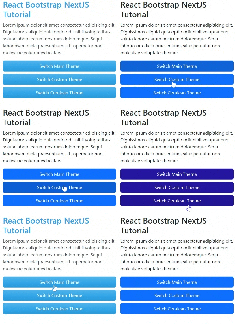
Next is to implement buttons to handle theme change. Here's an example in pages/index.tsx. We're using the useTheme custom hook that we created earlier.
import type { NextPage } from "next"; import { Button, Col, Container, Row, Stack } from "react-bootstrap"; import { useTheme } from "../components/BootstrapThemeProvider"; const Home: NextPage = () => { const { setTheme } = useTheme(); return ( <Container> <Row> <Col> <h1>React Bootstrap NextJS Tutorial</h1> <p> Lorem ipsum dolor sit amet consectetur adipisicing elit. Dignissimos aliquid quia optio odit nihil voluptatibus soluta labore earum nostrum doloremque. Sequi laboriosam dicta praesentium, sit aspernatur non molestiae voluptates beatae. </p> <Stack direction="vertical" gap={2}> <Button onClick={() => setTheme("main")}>Switch Main Theme</Button> <Button onClick={() => setTheme("custom")}> Switch Custom Theme </Button> <Button onClick={() => setTheme("cerulean")}> Switch Cerulean Theme </Button> </Stack> </Col> </Row> </Container> ); }; export default Home;123456789101112131415161718192021222324252627282930313233
That's basically it!
Full Code and Demo #
The full code can be accessed at: https://github.com/jmarioste/next-react-bootstrap-tutorial/tree/multiple-themes
Here's a gif of the demo but it can also be accessed at Vercel:

Conclusion #
We learned how to set up and change bootstrap themes dynamically in NextJS. The themes were from different sources, some were custom made and some are from bootswatch.
I know that we can still improve this solution, it would be awesome if the generated files are not so large that we need to include all bootstrap components when generating the CSS. I'll update this guide if I find a way.
If you like this tutorial, please leave a like or share this article. For future tutorials like this, please subscribe to our newsletter or follow me on Twitter.
Related Posts #
Credits: Image by sun jib from Pixabay


