Build a Responsive React Table of Contents Component with DaisyUI

Jasser Mark Arioste

Hello hustlers! In this article, you will learn how to build a table of contents component using React and daisyUI. You can use this tutorial as a guide if you're building it for an existing project, or a new project.
Final Output #
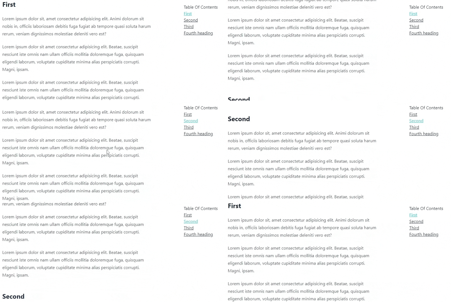
First, let me show you what we will be building today. Here is the final output for mobile and desktop versions:
Desktop

Mobile

Prerequisites #
You should know the react fundamentals and how to use basic react hooks.
Technology Used for this Project #
- React - A javascript library for building user interfaces.
- Typescript - For more maintainable code, typescript is always better than plain javascript.
- DaisyUI - This is the main UI Library we will be using built on top of TailwindCSS. This is optional and purely a preference on my part. You can use any UI Library you prefer.
- TailwindCSS - TailwindCSS's utility classes are super useful for modifying daisyUI components. And speeds up our ability to create a layout using a grid.
- NextJS - NextJS is one of the most popular react frameworks out there and we'll use it for this project. But you can also use
create-react-appbut I prefer NextJS. This is optional as well.
Identifying the TableOfContents Component Behavior
#
When implementing a component, we get excited and just start coding right away.
But as a developer, one of the skills you have to sharpen is how to think in a systematic way. It's very important to be able to come up with a solution based on all the available information.
In this step, we'll be identifying the behavior or specs of our component.
- The component should be loosely coupled with other components as much as possible.
- When a heading is on the top 15% of the page, the component should highlight the corresponding item. This is one of the usual behaviors in
TableOfContentscomponents. - When scrolling up and a heading is no longer on the top 15% of the page, the table of contents component should highlight the previous item.
- When clicking an item on the
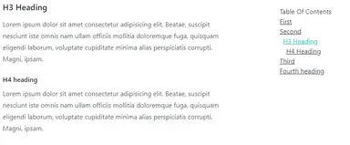
TableOfContentscomponent, it should highlight the item and scroll to the corresponding heading. - h3 and h4 elements should be indented.
- On a desktop screen, the component should be stickied on the top-right part of the page.
- On a mobile screen, there should be a button to show the table of contents.
Now that we've identified these behaviors and the design, let's start implementing them!
Project Setup using NextJS #
This step is optional, but I recommend doing it to follow along with this tutorial. I created a GitHub repo to kickstart our project. This already includes all the dependencies we'll be using. If you're implementing it on an existing project, you can skip to the react code.
Use the command below to initialize a new NextJS project based on the template.
npx create-next-app -e https://github.com/jmarioste/react-table-of-contents react-toc1
Once everything is installed, you can start up the project by running:
cd react-toc && yarn dev1
This will start a local development server at http://localhost:3000 where you can access your NextJS app.

Building the TableOfContents Component
#
We can proceed to build the table of contents for the app. First, let's create a new file components/TableOfContents.tsx.
import React from "react"; const TableOfContents = () => { return <div>TableOfContents</div>; }; export default TableOfContents;1234567
Step 1: Identifying the Props
In #1 of our requirements, we want our component to be as loosely coupled with other components as possible. In terms of where we get our data, there are two possible options:
- Use
Propsand pass headings data through it. I prefer this approach because it's loosely coupled. It doesn't matter where we get our data as long as it's passed through props! - Generate the data by querying h2, h3, and h4 headings using
document.querySelector. This approach is not too flexible because what if our data comes from the CMS or EditorJS? What if our page uses other h2/h3 headings on other parts of the page? It's prone to errors, so the first approach is better.
For our heading data, we need the text, level, and element id. Let's declare this in our props:
import React from "react"; export type Heading = { text: string; level: number; id: string; }; type Props = { headings: Heading[]; }; const TableOfContents = (props: Props) => { return <div>TableOfContents</div>; }; export default TableOfContents;1234567891011121314151617
Rendering the Heading Items in the ToC
Now that we have our props defined, let's render them in our component.
const TableOfContents = (props: Props) => {
  const { headings } = props;
  return (
    <div>
      <h2>Table Of Contents</h2>
      <ul>
        {headings.map((heading, index) => {
          const id = heading.id;
          return (
            <li key={index}>
              <a href={`#${id}`}>{heading.text}</a>
            </li>
          );
        })}
      </ul>
    </div>
  );
};123456789101112131415161718
Let's use it on our index page and see how it looks. Let's also modify the index page to adjust the layout.
// pages/index.tsx
const Home: NextPage = () => {
  //for now we use manual data
    const headingsData: Heading[] = [
    {
      level: 2,
      text: "First",
      id: "first",
    },
    {
      level: 2,
      text: "Second",
      id: "second",
    },
    {
      level: 2,
      text: "Third",
      id: "third",
    },
    {
      level: 2,
      text: "Fourth heading",
      id: "fourth-heading",
    },
  ];
  return (
    <div className="container max-w-5xl">
      <div className="grid grid-cols-12 gap-4">
        <main className="prose col-span-12 md:col-span-8">
          <Article />
        </main>
        <div className="hidden md:block col-span-4">
          <div className="sticky top-4">
            <TableOfContents headings={headingsData} />
          </div>
        </div>
      </div>
    </div>
  );
};12345678910111213141516171819202122232425262728293031323334353637383940
Explanation:
- Lines #4-25: We use this data to feed our
TableOfContentsComponent - Lines #28-29: Add the layout so that it's a two-column layout
- Lines #32-33: Add layout for the
TableOfContentscomponent and add astickyclass. This is #6 of our requirements above.
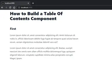
This is how our component looks. It looks plain for now but we're heading in the right direction!

Highlighting the ToC Item when Clicked.
Next, we'll implement behavior #4. When a ToC item is clicked, it should be highlighted. It should also jump or scroll to the corresponding heading.
const TableOfContents = (props: Props) => {
  const { headings } = props;
  const [activeId, setActiveId] = useState("");

  return (
    <div>
      <h2>Table Of Contents</h2>
      <ul>
        {headings.map((heading, index) => {
          const id = heading.id || heading.text.toLowerCase();
          const activeClass = activeId === id ? "link-accent" : "";
          return (
            <li key={index} onClick={() => setActiveId(id)}>
              <a href={`#${id}`} className={"link " + activeClass}>
                {heading.text}
              </a>
            </li>
          );
        })}
      </ul>
    </div>
  );
};1234567891011121314151617181920212223
Explanation
Lines #3: We create a state to track the currently active item in the ToC component.
Lines #10, #12-13: If the current item is active, we add a link-accent class to modify its color.
Here's how it looks now after clicking an item:

Adding Scroll Tracking using IntersectionObserver
Next, Let's Implement #2 of our requirements and add highlight the currently selected item when a heading is on the top 15% of the screen.
To add this, we need to define our IntersectionObserver via the useEffect hook. The IntersectionObsever allows us to track if a certain element is visible on a part of the screen.
// components/TableOfContents.tsx const TableOfContents = (props: Props) => { const { headings } = props; const [activeId, setActiveId] = useState(""); useEffect(() => { const observer = new IntersectionObserver( (entries) => { entries.forEach((entry) => { const id = entry.target.getAttribute("id")!; if (entry.isIntersecting) { setActiveId(id); } }); }, { rootMargin: "0% 0% -85% 0%", } ); headings.forEach((heading) => { const elem = document.getElementById(heading.id); if (elem) { observer.observe(elem); } }); }, []); ... }1234567891011121314151617181920212223242526272829
Explanation
Lines #7-14: We define the IntersectionObserverCallback. For each entry, we check if it's intersecting. Once entry.isIntersecting is true, we set it as the activeId. This will highlight the item.
Lines #15-17: We tell the IntersectionObserver to observe only the top 15% of the screen.
Lines #19-24: For each heading data, first we get the element with the same id. Then, we tell theIntersectionObserver to observe that element
Demo after this step

Tracking when the user scrolls up
Let's implement #3 of our requirements/behavior. It should highlight the previous item when the user is scrolling up and the heading is no longer in the top 15% of the screen.
To Implement this, we're going to add a few lines to our code.
const TableOfContents = (props: Props) => {
  ...
  const scrollRef = useRef(0);
  useEffect(() => {
    const observer = new IntersectionObserver(
      (entries) => {
        entries.forEach((entry) => {
          const id = entry.target.getAttribute("id")!;
          if (entry.isIntersecting) {
            setActiveId(id);
            scrollRef.current = window.scrollY;
          } else {
            const diff = scrollRef.current - window.scrollY;
            const isScrollingUp = diff > 0;
            const currentIndex = headings.findIndex((h) => h.id === id);
            const prevEntry = headings[currentIndex - 1];
            const prevId = prevEntry?.id;
            if (isScrollingUp && prevId) {
              setActiveId(id);
            }
          }
        });
      },
      {
        rootMargin: "0% 0% -85% 0%",
      }
    );
    ...
  })
  ...
}12345678910111213141516171819202122232425262728293031
Explanation
Line #3: We initialize a useRef to reference the current scrollY position.
Line #11: Once an entry intersects, we simply record the window.scrollY position.
Lines #13-14: We check if the user is scrolling up by subtracting the current scrollY from the previous scrollY position. If it's positive, that means the user is scrolling up.
Lines #15-20: We find the previous heading's id, and set it as the activeId if the user is scrolling up.
Demo after this step
Notice how it highlights the previous item once the heading goes down the screen. It doesn't wait for the previous heading to show up before highlighting.

Adding Indentation to h3 and h4 elements
To add indentation, you simply have to add padding to our <a/> elements depending on the heading level.
// components/TableOfContents.tsx
...
<ul>
        {headings.map((heading) => {
          const id = heading.id;
          const activeClass = activeId === id ? "link-accent" : "";
          const indentation = {
            3: " pl-2",
            4: " pl-4",
          };
          const level = heading.level as keyof typeof indentation;
          const paddingClass = indentation[level] ?? "";
          return (
            <li key={id} onClick={() => setActiveId(id)}>
              <a
                href={`#${id}`}
                className={"link " + activeClass + paddingClass}
              >
                {heading.text}
              </a>
            </li>
          );
        })}
      </ul>
...12345678910111213141516171819202122232425
Explanation
Lines #7-12: We identify the padding-left class modifier depending on the heading level.
Lines #17: Use that class in our ToC item.
Demo after this step
Modify your data in Articles.tsx and pages/index.tsx and add subheadings.

Implementing Responsive Design #
Currently, our TableOfContents component is only shown on medium-sized or larger devices. Let's create a wrapper component to target mobile devices.
// components/TocMobile.tsx import React, { useState } from "react"; import TableOfContents, { Heading } from "./TableOfContents"; type Props = { headings: Heading[]; }; const TocMobile = ({ headings }: Props) => { const [open, setOpen] = useState(false); const modalClass = open ? "modal-open" : ""; return ( <div> <a href="#my-modal-2" className="btn btn-circle fixed bottom-4 right-4 md:hidden" onClick={() => setOpen(true)} > TOC </a> <div className={"modal modal-bottom " + modalClass}> <div className="modal-box relative"> <button className="btn btn-ghost btn-sm absolute right-4 top-4" onClick={() => setOpen(false)} > x </button> <TableOfContents headings={headings} /> </div> </div> </div> ); }; export default TocMobile;123456789101112131415161718192021222324252627282930313233343536
It's pretty straightforward. It has the same props as our original TableOfContents component, and it has a button to show/hide a modal.
Now, let's use it in index.tsx.
import TocMobile from "components/TocMobile";
...
const Home: NextPage = () => {
  ...
  return (
    <div className="container max-w-5xl">
      <div className="grid grid-cols-12 gap-4">
        <main className="prose col-span-12 md:col-span-8">
          <Article />
        </main>
        <div className="hidden md:block col-span-4">
          <div className="sticky top-4">
            <TableOfContents headings={headingsData} />
          </div>
        </div>
        <TocMobile headings={headingsData} />
      </div>
    </div>
  );
};1234567891011121314151617181920
Result

What else can we do? #
In this tutorial, our <h2/> elements already had ids. What if they don't have ids?
Implement a TableComponentsGenerator component to generate the Headings data from the HTML. This is a wrapper component for TableOfContents. It should also add ids to the h2/h3 elements.
Conclusion #
We were able to build a fully responsive TableOfContents component in React. We used DaisyUI and Tailwind for styling, and we used IntersectionObserver API to get the behavior we wanted. We were also able to gain some insights into how to build components in react.
If you like this tutorial, please leave a like or share this article. For future tutorials like this, please subscribe to our newsletter or follow me on Twitter.
Resources / Credits #
Credits: Image by Kanenori from Pixabay


