How to Create Custom Formik Select Component

Jasser Mark Arioste

Hello hustlers! In this tutorial, you'll learn how to create a custom Formik select component using HeadlessUI, DaisyUI, and TailwindCSS.
To create a custom formik <select/> component, we'll first create a regular select component and create a wrapper component to integrate it into formik.
What Makes a Good <Select/> Component?
#
What makes a good select component? This will be our guide to implementing the component. For me, it should have the following:
- It should be written in Typescript for type safety and maintainability. Using typescript in your projects already prevents 90% of the runtime issues. We'll use NextJS with Typescript to achieve this.
- The UI should be customizable. Here, We'll use DaisyUI + TailwindCSS to style the component.
- The component should be accessible and respond to keyboard input. We'll use HeadlessUI to easily create accessible components.
- It should use Typescript generics to accept any kind of value for the options. We'll create a generic component to achieve this.
You can add or remove requirements depending on your project or situation.
Final Output #
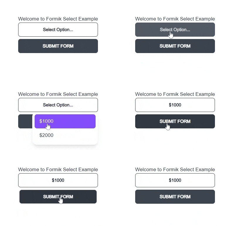
Here's a simple demo of the component we'll be making. You can also access the demo at Vercel.

Once the form is submitted, we just log the values:

Step 1 - Project Setup #
If you want to follow along, I created a GitHub repo that includes all the dependencies: @headlessui/react, formik, daisyui, and tailwindcss. You can easily set up this NextJS command by using the commands:
npx create-next-app -e https://github.com/jmarioste/formik-dropdown-example formik-dropdown-example
cd formik-dropdown-example && yarn dev1
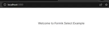
This will spin up a local server in localhost:3000 where you'll be greeted by this screen:

Step 2 - Defining a Generic Select Component #
We want to create a generic select component that can hold any value such as string, number, boolean, or object. Thus, we'll have to define generic component props. First, let's create a file components/CustomSelect.tsx.
import React from "react"; const CustomSelect = () => { return <div>CustomSelect</div>; }; export default CustomSelect;1234567
Next, let's define the generic props:
import React from "react"; //👇 generic type for select option export type CustomSelectOption<T> = { label: string; value: T; }; //👇 generic props export type CustomSelect<T> = { options: CustomSelectOption<T>[]; value: T; onChange(value: T): void; }; //👇 generic select component const CustomSelect = <T,>(props: CustomSelect<T>) => { return <div>FormikSelect</div>; }; export default CustomSelect;1234567891011121314151617
If you want to know more about generic components, check the guide by React Typescript Cheatsheet.
Now, we can use our generic component on the index page:
// pages/index.tsx import CustomSelect from "components/CustomSelect"; import { NextPage } from "next"; import React from "react"; const HomePage: NextPage = () => { return ( <div className={"container"}> <div className="grid place-content-center min-h-screen"> <div> <h1>Welcome to Formik Select Example</h1> <CustomSelect options={[ { label: "$1000", value: 1000, }, { label: "$2000", value: 2000, }, ]} value={0} onChange={(value) => { console.log(value); }} /> </div> </div> </div> ); }; export default HomePage;1234567891011121314151617181920212223242526272829303132
It doesn't have any functionality for now, but that's what we'll do in the next step:
Step 3 - Using HeadlessUI to add Functionality #
To implement <select/> component functionality, we'll use HeadlessUI since it does a good job of removing the hassle such as implementing keyboard shortcuts and open states. We'll use the <ListBox/> component from HeadlessUI since it's perfect for this use case.
// components/CustomSelect.tsx
...
import { Listbox } from "@headlessui/react";
...
const CustomSelect = <T,>(props: CustomSelect<T>) => {
  const options = props.options;
  const selectedItem = options.find((o) => o.value === props.value);
  const label = selectedItem?.label ?? "Select Option...";
  return (
    <Listbox value={props.value} onChange={props.onChange}>
      <Listbox.Button>{label}</Listbox.Button>
      <Listbox.Options>
        {options.map((option, i) => (
          <Listbox.Option key={i} value={option.value}>
            {option.label}
          </Listbox.Option>
        ))}
      </Listbox.Options>
    </Listbox>
  );
};
export default CustomSelect;12345678910111213141516171819202122
Next, let's modify the usage in pages/index.tsx and add a useState hook to track the value:
import CustomSelect from "components/CustomSelect"; import { NextPage } from "next"; import React, { useState } from "react"; const HomePage: NextPage = () => { const [val, setVal] = useState(0); return ( <div className={"container"}> <div className="grid place-content-center min-h-screen"> <div> <h1>Welcome to Formik Select Example</h1> <CustomSelect options={[ { label: "$1000", value: 1000, }, { label: "$2000", value: 2000, }, ]} value={val} onChange={(value) => setVal(value)} /> </div> </div> </div> ); }; export default HomePage;12345678910111213141516171819202122232425262728293031
After this step, you should have something like shown below. Note that it doesn't have any styling yet, we'll add that in the next step.

Step 4 - Customizing the CSS #
Let's add styling to our custom select component using DaisyUI and TailwindCSS classes. I also recommend using classnames npm package to easily organize classes based on component state.
import React, { Fragment } from "react"; import { Listbox } from "@headlessui/react"; import cn from "classnames"; //👇 generic type for select option export type CustomSelectOption<T> = { label: string; value: T; }; //👇 generic props export type CustomSelect<T> = { options: CustomSelectOption<T>[]; value: T; onChange(value: T): void; }; //👇 generic select component const CustomSelect = <T,>(props: CustomSelect<T>) => { const options = props.options; const selectedItem = options.find((o) => o.value === props.value); const label = selectedItem?.label ?? "Select Option..."; return ( <Listbox value={props.value} onChange={props.onChange} as={Fragment}> <div className={"dropdown dropdown-end w-full"}> <Listbox.Button className="btn btn-outline w-full relative no-animation normal-case"> {label} </Listbox.Button> <Listbox.Options className={cn({ "dropdown-content menu": true, "p-2 shadow-lg bg-base-100 rounded-box w-56": true, })} > {options.map((option, i) => ( <Listbox.Option key={i} value={option.value}> {/* 👇 Use render props to get active, disabled and selected state */} {({ active, disabled, selected }) => ( <button className={cn({ active: selected, "btn-disabled": disabled, "bg-primary/80 text-primary-content": active, })} > {option.label} </button> )} </Listbox.Option> ))} </Listbox.Options> </div> </Listbox> ); }; export default CustomSelect;1234567891011121314151617181920212223242526272829303132333435363738394041424344454647484950515253
Explanation:
Lines 35-45: We use render props that ListBox.Option components provide to get the state for each option and use classnames package to enable/disable the classes based on the state (active, disabled, or selected).
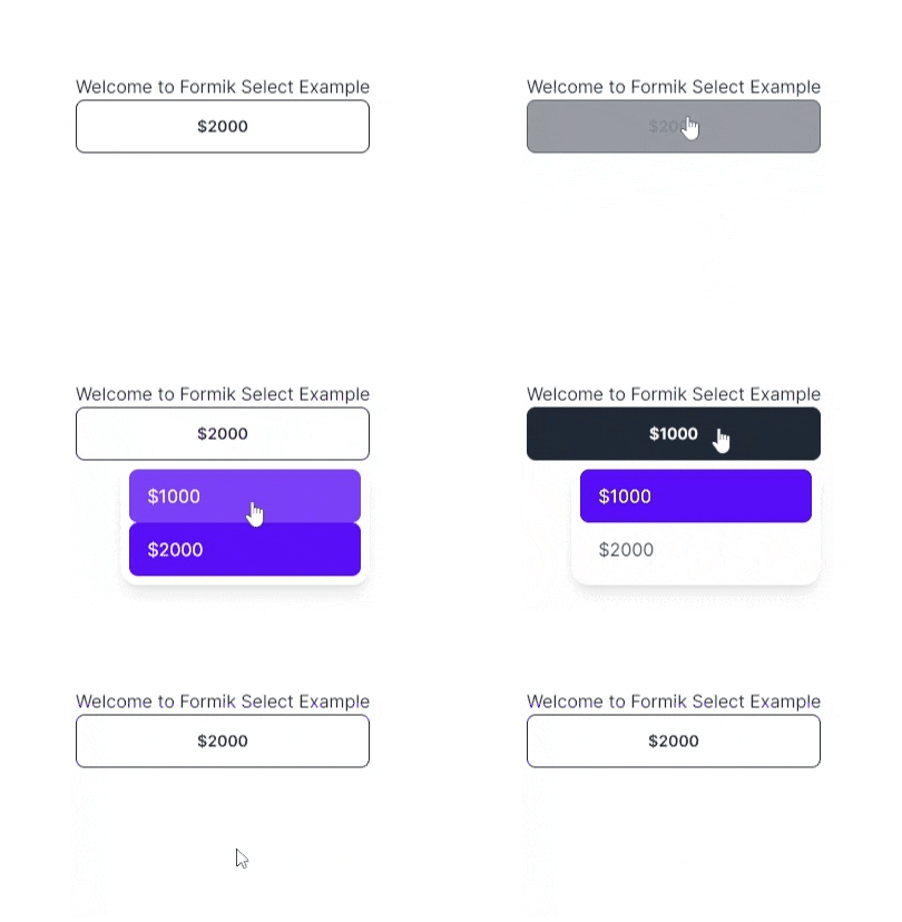
After this step, you've got a pretty good looking <select/> component.

That's it for the generic select component. Next, we'll create a wrapper component to integrate Formik.
Step 5 - Integrating Formik #
To integrate Formik, we'll create a wrapper component that uses useField and useFormikContext hooks from Formik.
First, create a file components/FormikSelect.tsx and copy the code below:
// components/FormikSelect import { useField, useFormikContext } from "formik"; import React from "react"; import CustomSelect, { CustomSelectOption } from "./CustomSelect"; type Props<T> = { name: string; options: CustomSelectOption<T>[]; }; const FormikSelect = <T,>(props: Props<T>) => { const name = props.name; const [field] = useField<T>(name); const { setFieldValue } = useFormikContext(); // 👇 listen to any change in value and use setFieldValue // to modify the formik context state const handleChange = (val: T) => setFieldValue(name, val); return ( <CustomSelect options={props.options} onChange={handleChange} value={field.value} /> ); }; export default FormikSelect;123456789101112131415161718192021222324
Step 6 - Usage #
To use the <FormikSelect/> component, we'll have to use the <Formik/> provider. Let's modify our pages/index.tsx page:
import FormikSelect from "components/FormikSelect"; import { Form, Formik } from "formik"; import { NextPage } from "next"; import React from "react"; const HomePage: NextPage = () => { return ( <div className={"container"}> <div className="grid place-content-center min-h-screen"> <div> <h1>Welcome to Formik Select Example</h1> <Formik onSubmit={(values) => alert(JSON.stringify(values, null, 4))} initialValues={{ salary: 0, }} > <Form className="flex flex-col gap-2"> <FormikSelect name="salary" options={[ { label: "$1000", value: 1000, }, { label: "$2000", value: 2000, }, ]} /> <button className="btn" type="submit"> Submit Form </button> </Form> </Formik> </div> </div> </div> ); }; export default HomePage;12345678910111213141516171819202122232425262728293031323334353637383940
Explanation:
We no longer use the useState hook since the formik context provides all the states for the form.
We added a name prop to both <FormikSelect/> components to correspond to the initialValues.
We also added a button to submit the form.
That's it!
Full Code and Demo #
The full code can be accessed at GiHub: jmarioste/formik-dropdown-example. The demo can be accessed at Vercel.
Conclusion #
We learned how to create a custom select component using HeadlessUI and DaisyUI and integrate it into Formik by using useField and useFormikContext hooks.
If you like this tutorial, please leave a like or share this article. For future tutorials like this, please subscribe to our newsletter or follow me on Twitter.
Credits: Image by Сергей Наревич from Pixabay


