How to Create a Custom MUI Search Bar Component in NextJS

Jasser Mark Arioste

Hello, hustlers! In this tutorial, you'll learn how to create a custom SearchBar component using MUI. We'll use NextJS as our React framework and use MUI with it. We'll also use typescript throughout the tutorial.
Introduction #
So you're tasked to create a SearchBar component using MUI but don't know where to start? Don't worry this tutorial will guide you step-by-step. MUI doesn't have a SearchBar component out of the box since there can be different behavior and UI design for every project. So, we'll have to create one from scratch using the existing MUI components that are available to us.
Questions to Ask / Requirements #
Before implementing something, we need to ask some questions to really know what to implement. A <Searchbar /> component can have many different behaviors and UI. Here are a few questions you might ask yourself:
- What does the search bar look like? - Answer. See the final output.
- What's the specific behavior of the search bar? Do we show results as we type or redirect to a search results page when the form is submitted? - Answer. It depends on the requirements
- Do we need to show the recent searches of the user when the
<SearchBar/>is focused? Similar to Google<SearchBar/>. - Answer. Yes, we'll add the recent searches as a bonus step.
Final Output #
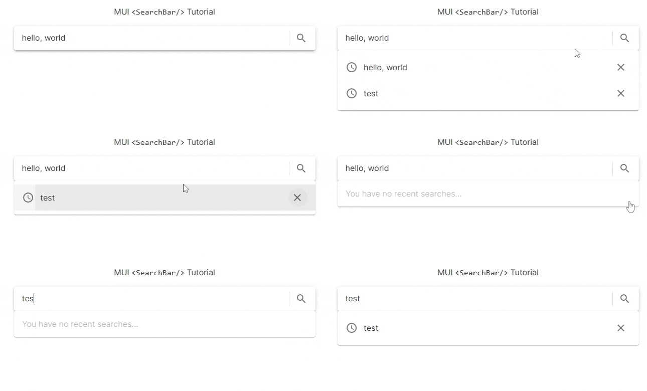
Here's the final output of what we'll be making today:

Tutorial Objectives #
Here are our tutorial objectives following our requirements:
- Set up MUI with NextJS
- Create an MUI
<Searchbar/>component - Create a
<RecentSearches/>component that utilizes the localStorage API to display the recent searches
Step 1 - Project Setup #
I assume you already have MUI setup in your project.
However, if you want to follow this tutorial from scratch, I created a NextJS starter template with MUI already preinstalled. Run the following command to clone the project:
npx create-next-app -e https://github.com/jmarioste/nextjs-mui-typescript-starter mui-searchbar-tutorialAfter everything is installed. We'll have to install some dependencies:
yarn add @mui/icons-material usehooks-tsWe'll be using usehooks-ts package for the useLocalStorage and useClickOutside hooks. It's just a very useful library to have in React projects.
Step 2 - Creating a SearchBar component #
In this step, we'll create a <SearchBar/> component. First, create the file src/components/Searchbar.tsx. Copy the code below, I added comments so make sure you don't skip them.
// src/components/Searchbar.tsx import { SearchOutlined } from "@mui/icons-material"; import { Divider, IconButton, InputBase, InputBaseProps, Paper, } from "@mui/material"; import { useState } from "react"; type Props = { // the outside components only needs to know if the searchbar form has been submitted onSubmit(searchTerm: string): void; // add inputProps so that we can listen to onFocus / onBlur events if needed inputProps: InputBaseProps; }; const Searchbar = (props: Props) => { const [searchTerm, setSearchTerm] = useState(""); return ( // We use the Paper component since it already contains the style that we want. <Paper component="form" elevation={3} sx={{ display: "flex", alignItems: "center", px: 1, py: 0.5 }} onSubmit={(e) => { e.preventDefault(); props.onSubmit((searchTerm as string) ?? ""); }} > {/* Input base contains the fewest styles possible so it's perfect for creating custom components like these */} <InputBase sx={{ ml: 1, flex: 1 }} placeholder="Search..." inputProps={{ "aria-label": "search" }} value={searchTerm} onChange={(e) => { setSearchTerm(e.target.value); }} {...props.inputProps} /> <Divider sx={{ height: 28, mx: 0.5 }} orientation="vertical" /> <IconButton type="submit"> <SearchOutlined /> </IconButton> </Paper> ); }; export default Searchbar;1234567891011121314151617181920212223242526272829303132333435363738394041424344454647484950
To use this component, let's modify pages/index.tsx:
// pages/index.tsx import type { NextPage } from "next"; import { Box, Typography } from "@mui/material"; import Searchbar from "../src/components/Searchbar"; import { useRouter } from "next/router"; const Home: NextPage = () => { const router = useRouter(); return ( <Box maxWidth={"sm"} margin="auto"> <Typography textAlign="center" my={2}> MUI <code>{`<SearchBar/>`}</code> Tutorial </Typography> <Box> <Searchbar onSubmit={(searchTerm: string) => { // when the user submits the form, we only modify the router query parameters router.push({ query: { search: searchTerm, }, }); }} inputProps={{}} /> </Box> </Box> ); }; export default Home;1234567891011121314151617181920212223242526272829303132
Explanation:
We're exposing the onSubmit function to the component using the <Searchbar/> component so that we can set any behavior for this component.
In this example, when the user searches for something, we're only modifying the router query parameters. But in your case, you could call the backend API or reroute the user to a new page.
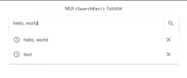
After this step, you'll have the following output:

Step 4 - Implementing Recent Searches #
Next, let's implement the RecentSearches component so that the user will know and will be able to select his recent searches.
We're going to use the useLocalStorage hook to save the previous searches of the user. So first, let's create a custom hook: useRecentSearches.
// src/hooks/useRecentSearches.tsx import { useLocalStorage } from "usehooks-ts"; export const useRecentSearches = () => { const [recentSearches, setRecentSearches] = useLocalStorage<string[]>( "recent-searches", [] ); return { recentSearches, setRecentSearches, }; };1234567891011121314
Now, let's create the <RecentSearches/> component. First, create the file src/components/RecentSearches.tsx.
// src/components/RecentSearches.tsx import { Menu, MenuItem, MenuList, PopperProps, Popper, Fade, Paper, IconButton, ListItemIcon, ListItemText, } from "@mui/material"; import { useRecentSearches } from "../hooks/useRecentSearches"; import { AccessTime, Close } from "@mui/icons-material"; import { useOnClickOutside } from "usehooks-ts"; import { useRef } from "react"; // we add an onClose prop in addition to the PopperProps type Props = { onClose(): void; } & PopperProps; const RecentSearches = ({ open, anchorEl, onClose }: Props) => { const { recentSearches, setRecentSearches } = useRecentSearches(); const paperRef = useRef<HTMLDivElement>(null); const el = anchorEl as HTMLElement; // remove item when x button is click for an item const removeItem = (searchTerm: string) => { setRecentSearches(recentSearches.filter((item) => item !== searchTerm)); }; //listen to clickOutside events using this hook from usehooks-ts useOnClickOutside(paperRef, onClose); if (!anchorEl) return null; return ( <Popper anchorEl={anchorEl} open={open} disablePortal> {/* set the width the same as the anchorElement */} <Paper sx={{ width: el.clientWidth }} ref={paperRef}> <MenuList> {!recentSearches.length ? ( <> <MenuItem disabled>You have no recent searches...</MenuItem> </> ) : ( <> {recentSearches.map((searchTerm, i) => { return ( <MenuItem key={i}> <ListItemIcon> <AccessTime /> </ListItemIcon> <ListItemText>{searchTerm}</ListItemText> <IconButton onClick={() => removeItem(searchTerm)}> <Close /> </IconButton> </MenuItem> ); })} </> )} </MenuList> </Paper> </Popper> ); }; export default RecentSearches;12345678910111213141516171819202122232425262728293031323334353637383940414243444546474849505152535455565758596061626364656667
Now to use this component, we'll have to modify our pages/index.tsx quite a bit. The highlighted items are added to the code.
// pages/index.tsx import type { NextPage } from "next"; import { Box, Typography } from "@mui/material"; import Searchbar from "../src/components/Searchbar"; import { useRouter } from "next/router"; import { useRecentSearches } from "../src/hooks/useRecentSearches"; import RecentSearches from "../src/components/RecentSearches"; import { useRef, useState } from "react"; const Home: NextPage = () => { const router = useRouter(); const { recentSearches, setRecentSearches } = useRecentSearches(); // track state for showing RecentSearches const [open, setOpen] = useState(false); const anchorEl = useRef<HTMLDivElement>(null); return ( <Box maxWidth={"sm"} margin="auto"> <Typography textAlign="center" my={2}> MUI <code>{`<SearchBar/>`}</code> Tutorial </Typography> <Box ref={anchorEl}> <Searchbar onSubmit={(searchTerm: string) => { // when the user submits the form, we only modify the router query parameters router.push({ query: { search: searchTerm, }, }); // also add to push recent searches after every search if (!recentSearches.includes(searchTerm)) { setRecentSearches([searchTerm, ...recentSearches]); } }} inputProps={{ onFocus: () => setOpen(true), }} /> <RecentSearches open={open} anchorEl={anchorEl.current} onClose={() => { setOpen(false); }} /> </Box> </Box> ); }; export default Home;12345678910111213141516171819202122232425262728293031323334353637383940414243444546474849505152
After this step, you'll get something like this:

You'll notice that the RecentSearches and Searchbar components do not have any dependency on each other. The container component which is the <Home/> component contains all the logic.
That's basically it!
Code and Demo #
The full code can be accessed at my GitHub: jmarioste/mui-search-bar-tutorial.
You can play with the Demo on Stackblitz: MUI Search Bar Tutorial. Note that it might not work on Chrome due to low memory error. For that, you can use a different browser like Firefox or Edge.
Conclusion #
You learned how to create a custom search bar using MUI components in a NextJS project. Here, it's vital to think about what events you have to expose to other components.
If you like this tutorial, please leave a like or share this article. For future tutorials like this, please subscribe to our newsletter or follow me on GitHub.
Resources #
If you'd like more info on the MUI components I used, here are the links:
Credits: Image by Huu Duc DO from Pixabay


