How to Create a Custom React Card Slider Component

Jasser Mark Arioste

Hello, hustlers! In this tutorial, you'll learn how to create a react card slider component by using the EmblaCarousel package and TailwindCSS for styling. We'll use NextJS as our react framework of choice and we'll also use Typescript for maintainability and type safety.
Final Output #
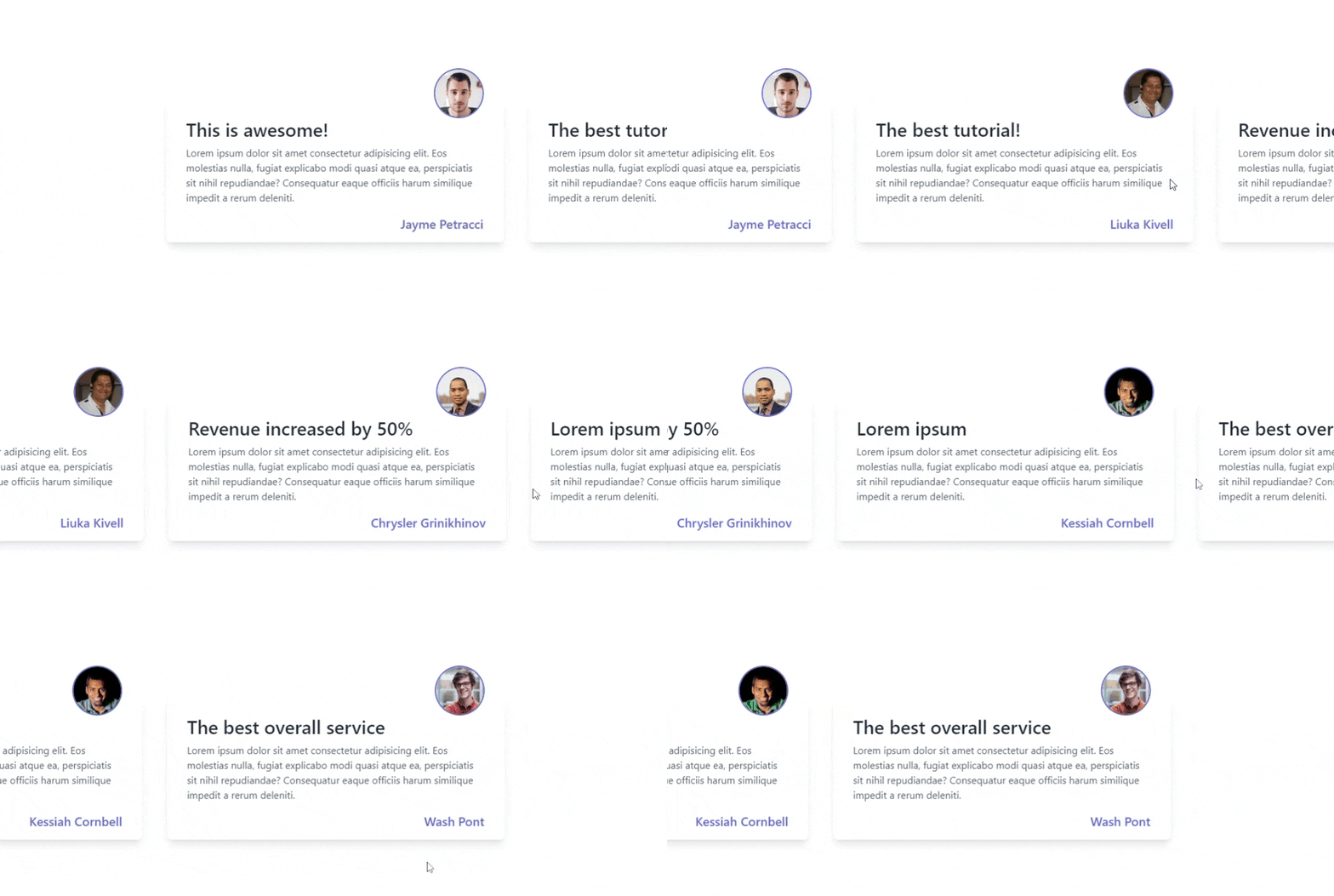
Suppose we're making a testimonial section that can be swiped right or left. By the end of this tutorial, you'll be able to build the following component.
This is for the desktop version:

Here's the mobile version:

What is EmblaCarousel? #
Embla carousel is a lightweight carousel library with fluid motion and great swipe precision. It's perfect for building custom carousels or sliders.
Why use EmblaCarousel? #
I like using EmblaCarousel because it's very well-documented and it allows for maximum flexibility and customizability. Using it will probably cover 99% of use cases for carousel/slider implementation.
Now that you know the package we'll be using, let's start implementing!
Step 0 - Project Setup #
Let's create a new NextJS application and install the dependencies we'll be needing. Run the following command to create a new NextJS Project with Typescript and TailwindCSS configured.
npx create-next-app --ts --tailwind react-slider-tutorialThe above command will also ask you a few questions about your preferences such as ESLint, src directory, etc.
Next, let's install embla-carousel-react package
cd react-slider-tutorial
yarn add embla-carousel-react
Step 1 - Preparing the Data #
For the data, let's create the file data/testimonials.json and copy the following:
[
  {
    "author": "Jayme Petracci",
    "title": "This is awesome!",
    "content": "Lorem ipsum ...",
    "imgSrc": "https://randomuser.me/api/portraits/men/46.jpg"
  },
  {
    "author": "Liuka Kivell",
    "title": "The best tutorial!",
    "content": "Lorem ipsum ...",
    "imgSrc": "https://randomuser.me/api/portraits/men/48.jpg"
  },
  {
    "author": "Chrysler Grinikhinov",
    "title": "Revenue increased by 50%",
    "content": "Lorem ipsum ...",
    "imgSrc": "https://randomuser.me/api/portraits/men/49.jpg"
  },
  {
    "author": "Kessiah Cornbell",
    "title": "Lorem ipsum",
    "content": "Lorem ipsum ...",
    "imgSrc": "https://randomuser.me/api/portraits/men/50.jpg"
  },
  {
    "author": "Wash Pont",
    "title": "The best overall service",
    "content": "Lorem ipsum ...",
    "imgSrc": "https://randomuser.me/api/portraits/men/51.jpg"
  }
]1234567891011121314151617181920212223242526272829303132
Later, we'll import this when populating our Card component.
Step 2 - Creating the Card Component #
Next, let's create a simple <Card/> component. Create the file components/TestimonialCard.tsx. This component is a purely display component and does not have any behavior. Note that you don't have to copy this, I used testimonial card from tailwind components as a reference (Credits to the owner). You can create any card component as you wish.
import Image from "next/image"; import Link from "next/link"; type Props = { title: string; imgSrc: string; content: string; author: string; }; const TestimonialCard = (props: Props) => { return ( <div className="py-4 px-8 bg-white shadow-lg rounded-lg my-20"> <div className="flex justify-center md:justify-end -mt-16"> <Image alt={props.author} className="w-20 h-20 object-cover rounded-full border-2 border-indigo-500" height={80} width={80} src={props.imgSrc} /> </div> <div> <h2 className="text-gray-800 text-3xl font-semibold">{props.title}</h2> <p className="mt-2 text-gray-600">{props.content}</p> </div> <div className="flex justify-end mt-4"> <Link href="#" className="text-xl font-medium text-indigo-500"> {props.author} </Link> </div> </div> ); }; export default TestimonialCard;1234567891011121314151617181920212223242526272829303132333435
Step 3 - Creating the Slider Component #
Next, let's create the slider/carousel component. Create the file components/Slider.tsx and copy the code below. I added comments so make sure you don't skip them.
import useEmblaCarousel, { EmblaOptionsType } from "embla-carousel-react"; import { PropsWithChildren } from "react"; // 1. define the props type Props = { options?: EmblaOptionsType } & PropsWithChildren; const Slider = ({ children, options }: Props) => { // 2. initialize EmblaCarousel using the custom hook const [emblaRef] = useEmblaCarousel({ slidesToScroll: 1, align: "start", ...options, }); return ( // 3. set ref as emblaRef. // make sure we have overflow-hidden and flex so that it displays properly <div className="overflow-hidden" ref={emblaRef}> <div className="flex gap-10">{children}</div> </div> ); }; export default Slider;1234567891011121314151617181920212223
Explanation:
We created a reusable Slider component that doesn't need to have knowledge of its contents by using props.children. Later, when integrating, you can see that the card component doesn't matter as you'll be able to use any card as you wish.
If you need a more complex example such as having buttons and dots/thumbnails, check out my other tutorial: How to Create a Carousel in NextJS using TailwindCSS and EmblaCarousel. It covers a more in-depth explanation of the implementation.
Step 4 - Integrating Both Components #
Next, let's integrate both components into the pages/index.tsx file. The pages/index.tsx file represents the "/" route in NextJS.
// pages/index.tsx // 1. import all the necessary components and data import Slider from "@/components/Slider"; import TestimonialCard from "@/components/TestimonialCard"; import testimonials from "@/data/testimonials.json"; export default function Home() { return ( <main className={`flex min-h-screen flex-col items-center justify-between py-24`} > {/* 2. make sure our carousel container takes up the full screen width using w-screen */} <div className="w-screen"> <Slider options={{ align: "center" }}> {testimonials.map((testimonial, i) => ( // 3. flex-[0_0_50%] set the width of each card to 50% of the viewport // for mobile devices we use 90% width <div key={i} className="flex-[0_0_90%] md:flex-[0_0_50%]"> <TestimonialCard {...testimonial} /> </div> ))} </Slider> </div> </main> ); }1234567891011121314151617181920212223242526
You can change the width of the card by modifying the flex-[0_0_xx%] class depending on your requirements. In line 14, we used a custom option {align:"center} so that each card will be aligned at the center when swiping but you can check more options in the documentation.
That's basically it!
Full Code and Demo #
The full code is available on my GitHub page: jmarioste/react-card-slider-tutorial
The demo is available on Stackblitz: React Card Slider Tutorial
Conclusion #
You learned how to create a react card slider by using EmblaCarousel and TailwindCSS library. We only covered a basic example but there's a lot more you can do by checking out their examples.
If you like this tutorial, please leave a like or share this article. For future tutorials like this, please subscribe to our newsletter or follow me on GitHub.


