How to Create A Multi-Step Form In React or NextJS

Jasser Mark Arioste

Hello, hustlers! In this article, you'll learn how to create a multi-step form with client-side validation on each step.
Introduction #
Recently, I've been tasked to create a multi-step signup form for a project, so I decided to share how I did it in this article.
In the old days of the web, sign-up forms were usually long with many input fields. But more recent UX research shows that breaking it into multiple steps so that the user will see fewer input fields will result in a smoother sign-up experience. In other words, it increases conversion rates for websites.
Technologies and Tools Used #
In this tutorial, we'll be using the following tools or technologies besides React:
- NextJS - use the next/navigation component for navigating between form steps. You'll use the new
/approuter of Next 13.4 - Formik - to easily handle validation and form state.
- Yup - create a schema for client-side validation and also seamlessly integrates with Formik.
- Material UI (MUI) - For the beautiful UI Components
- Tailwind - For utility classes
Final Output #
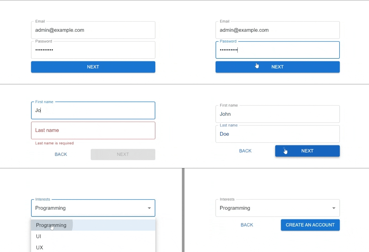
Here's the final output

Step 1: Project Setup #
First, let's create a new NextJS project by invoking the following command.
npx create-next-app --ts --app --tailwind --use-yarn react-multi-step-form-tutorial
Explanation:
--ts- Initialize the project as a Typescript project. This automatically creates thetsconfig.jsonand creates.tsxfiles instead of.jsfiles.--app- Initializes the project with the/appdirectory instead of the/pagesdirectory.--tailwind- Initializes the project with Tailwindcss. Automatically uses the tailwind utility classes, createstailwind.config.jsandpostcss.config.jsfiles. and modifies theglobals.cssfile to include tailwind directives.--use-yarn- Explicitly tells the CLI to use yarn instead of npm which will useyarn.lockinstead of package-lock.json. This is a personal preference of mine.react-multi-step-form-tutorial- name of the project.
Next, modify the /app/globals.css files since it includes styles that you don't want and will conflict with MUI styling. Modify it so that it only includes the code below.
// app/globals.css /* @tailwind base; */ /* This Conflicts with MUI Styling*/ @tailwind components; @tailwind utilities;1234
Step 2: Installing Dependencies #
In this step, you'll install formik, yup, and MUI packages. Install the dependencies that you'll be needing in this example by invoking the following command:
yarn add formik @mui/material @emotion/styled @emotion/react yupStep 2: Creating the SignUpForm Component #
In this step, we'll create the container component <SignUpForm/>. This component will handle the logic for navigating through the form steps.
First, create the file components/signup/FormStepProps.tsx.
// components/signup/FormStepProps.tsx
export type FromStepProps = {
  onNext(): void;
  onPrevious(): void;
};
export type FormStepComponentType = React.FunctionComponent<FromStepProps>;123456
In the above code, we're defining a common component type that will be used by the Step components as well as the container component. You'll see this later.
Next, create the file components/signup/SignUpForm.tsx and copy the code below:
// components/signup/SignUpForm.tsx "use client"; import { Form, Formik } from "formik"; import React from "react"; import { useSearchParams, useRouter } from "next/navigation"; import { FormStepComponentType } from "./FormStepProps"; type Props = { steps: FormStepComponentType[]; }; const SignUpForm = ({ steps }: Props) => { const router = useRouter(); const searchParams = useSearchParams(); const page = searchParams.get("step"); // get the current step using search params const pageIndex = page ? +page : 1; // get the step component const StepComponent = steps.at(pageIndex - 1); const stepExists = !!StepComponent; return ( // use Formik context to handle the form state and onSubmit <Formik onSubmit={(values: any) => { console.log(values); }} initialValues={{ email: "", password: "", firstName: "", lastName: "", interests: "", }} > <Form> {/* render the step component if it exists */} {!!stepExists && ( <StepComponent onNext={() => { // navigate to next page if it is not the last page using `router.push` if (pageIndex < steps.length) { const nextPage = pageIndex + 1; router.push(`/signup?step=${nextPage}`); } }} onPrevious={() => { // navigate to the previous page using `router.push` const prevPage = pageIndex - 1; if (prevPage > 1) { router.push(`/signup?step=${prevPage}`); } else { router.push("/signup"); } }} /> )} </Form> </Formik> ); }; export default SignUpForm;123456789101112131415161718192021222324252627282930313233343536373839404142434445464748495051525354555657585960
Explanation:
First of all, in line 2 we use the "use client" directive to specify that this is a client component since we're using hooks. This is a special directive in NextJS 13.4.
In line 9, we expect a steps prop which is an array of FormStepComponentType as we defined above.
In lines 13-17, we get the current StepComponent by getting the step param from the URL searchParams.
In line 18, we check if the step exists since the .at() method possibly returns null.
In lines 21-32, we use a <Formik/> provider component to encompass the whole state of our multi-step form. lines, 25-31 are just arbitrary initial values for our signup form.
In lines 36-53, we render the step component and add the appropriate logic for onNext and onPrevious callbacks. If we didn't define the steps prop with FormStepComponentType[] there will be a type error when using onNext or onPrevious.
That's basically it for the container component.
Step 3: Integrating Formik and MUI #
In the next steps, we'll integrate MUI components with Formik so that they display errors properly. Since we're using Formik and MUI, we'll create two components FormikTextField and FormikSelect to integrate MUI with Formik.
Step 3.1: Creating <FormikTextField/> Component
#
In this step, we'll create the FormikTextField component. It reads from and writes to the Formik context state. First, create the file components/formik/FormikTextField.tsx.
"use client"; import { TextField as MuiTextField, TextFieldProps } from "@mui/material"; import { FieldInputProps, useField } from "formik"; export type FormikTextFieldProps = { name: string } & TextFieldProps; type TexFieldConfig = TextFieldProps & FieldInputProps<any>; const FormikTextField = ({ name, ...props }: FormikTextFieldProps) => { const [field, meta] = useField(name); const newProps: TexFieldConfig = { ...field, ...props, }; if (meta.error) { newProps.error = true; newProps.helperText = meta.error; } return <MuiTextField {...newProps} />; }; export default FormikTextField;123456789101112131415161718192021222324
In line 9, we use the useField hook from formik to get the field and meta objects by using the name prop. The field object has value and onChange properties so we don't have to define them. And on lines 11-14, we define a new prop TextFieldConfig and pass this object to the <MuiTextFieldComponent/> on line 21.
Step 3.2: Creating <FormikSelect/> Component
#
In this step, we'll create a <FormikSelect/> component to integrate MUI Select and Formik. Create the file components/formik/FormikSelect.tsx.
"use client"; import { FormControl, Select, SelectProps, InputLabel, FormHelperText, } from "@mui/material"; import { useField } from "formik"; import React from "react"; type Props = { name: string; id: string; helperText?: string } & SelectProps; const FormikSelect: React.FC<Props> = ({ name, children, helperText, size, ...props }) => { const [field, meta] = useField(name); const error = Boolean(meta.touched && meta.error); const showHelperText = error || !!helperText; const id = props.id; return ( <FormControl fullWidth error={error} size={size}> <InputLabel id={id + "-label"}>{props.label}</InputLabel> <Select {...props} {...field} id={id} labelId={id + "-label"}> {children} </Select> {showHelperText && ( <FormHelperText>{meta.error ?? helperText}</FormHelperText> )} </FormControl> ); }; export default FormikSelect;12345678910111213141516171819202122232425262728293031323334353637383940
It's pretty similar to the FormikTextField component. We get the state using useField formik and render it appropriately.
Step 4: Creating Steps Component #
Now that we have the necessary input components, we can now create the steps for our form. Each step component must follow the FormStepComponentType type. To do this, first, create the file components/signup/Page1.tsx.
// components/signu/Page1.tsx "use client"; import { Button } from "@mui/material"; import React from "react"; import { FormStepComponentType } from "@/components/signup/FormStepProps"; import FormikTextField from "../formik/FormikTextField"; const Page1: FormStepComponentType = (props) => { return ( <div className="flex flex-col gap-2 w-[400px]"> <FormikTextField name="email" label="Email" /> <FormikTextField name="password" label="Password" type="password" /> <Button variant="contained" onClick={props.onNext}> Next </Button> </div> ); }; export default Page1;1234567891011121314151617181920
On line 8, we define the component with the FormStepComponentType. So on line 13, we can easily call props.onNext without getting a type error.
In lines 11 & 12, we use the FormikTextField component and pass a name prop. The name prop should correspond with the initial values on SignUpFormComponent.
// components/signup/SignUpForm.tsx
const SignUpForm = ({ steps }: Props) => {
  ...
  return (
    // use Formik context to handle the form state and onSubmit
    <Formik
      onSubmit={(values: any) => {
        console.log(values);
      }}
      initialValues={{
        email: "",
        password: "",
        firstName: "",
        lastName: "",
        interests: "",
      }}
    >
    ...
    </Formik>
 )
}123456789101112131415161718192021
Now, let's quickly create other two components:
Page2.tsx:
// components/signup/Page2.tsx "use client"; import { Button } from "@mui/material"; import React from "react"; import { FormStepComponentType } from "./FormStepProps"; import FormikTextField from "../formik/FormikTextField"; const Page2: FormStepComponentType = (props) => { return ( <div className="flex flex-col gap-2 w-[400px]"> <FormikTextField name="firstName" label="First name"></FormikTextField> <FormikTextField name="lastName" label="Last name"></FormikTextField> <div className="flex"> <Button onClick={props.onPrevious} className="flex-grow"> Back </Button> <Button variant="contained" onClick={props.onNext} className="flex-grow" > Next </Button> </div> </div> ); }; export default Page2;1234567891011121314151617181920212223242526272829
Page3.tsx:
"use client"; import { Button, MenuItem } from "@mui/material"; import { FormStepComponentType } from "./FormStepProps"; import FormikSelect from "../formik/FormikSelect"; const Page3: FormStepComponentType = (props) => { return ( <div className="flex flex-col gap-2 w-[400px]"> <FormikSelect label="Interests" labelId="simple-select-label" id="simple-select" name={"interests"} > <MenuItem value="Programming">Programming</MenuItem> <MenuItem value="UI">UI</MenuItem> <MenuItem value="UX">UX</MenuItem> <MenuItem value="Coding">Coding</MenuItem> </FormikSelect> <div className="flex justify-between gap-2"> <Button onClick={props.onPrevious} className="flex-grow"> Back </Button> <Button type="submit" variant="contained"> Create an Account </Button> </div> </div> ); }; export default Page3;1234567891011121314151617181920212223242526272829303132
on Page3.tsx, we don't use props.onNext since this is the final step. we just attach a type="submit" prop to trigger the onSubmit in the <Formik> provider the SignUpPage component.
Step 5: Integrating All the Steps #
Next, we'll assemble our form with all the steps involved. First, create the file /app/signup/page.tsx.
// app/signup/page.tsx import Page1 from "@/components/signup/Page1"; import Page2 from "@/components/signup/Page2"; import Page3 from "@/components/signup/Page3"; import SignUpForm from "@/components/signup/SignUpForm"; import React from "react"; const SignupPage = () => { return ( <div className="grid h-screen place-items-center"> <SignUpForm steps={[Page1, Page2, Page3]} /> </div> ); }; export default SignupPage;12345678910111213141516
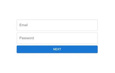
Now when you go to /signup route, you should see the following:

Step 6: Adding Client-Side Validation #
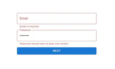
Right now, when you go to the /slignup route, you can just press the next and previous buttons even though the fields are empty. Let's add some client-side validation by creating a yup schema.
First, create the file components/signup/signupSchema.ts:
import { object, string } from "yup"; export const signupSchema = object({ email: string() .required("Email is required") .email("Please enter a valid email address"), password: string() .required("Password is required") .min(8, "Password should have a minimum of 8 characters") .matches(/\d/, "Password should have at least one number") .matches(/[A-Z]/, "Password should have at least one uppercase letter") .matches(/[a-z]/, "Password should have at least one lowercase letter"), firstName: string().required("First name is required"), lastName: string().required("Last name is required"), interests: string().required("Intereset is required."), });12345678910111213141516
To know more about how to create a yup schema, you can read the documentation.
Next, we can now use this schema by using the validationSchema prop in the Formik provider component. Let's modify our <SignUpComponent/> to do just this.
import { signupSchema } from "./signupSchema";
const SignUpForm = ({ steps }: Props) => {
  ...
  return (
    // use Formik context to handle the form state and onSubmit
    <Formik
      onSubmit={(values: any) => {
        console.log(values);
      }}
      validationSchema={signupSchema}
      initialValues={{
      }}
    > ... </Formik>
  )
}123456789101112131415
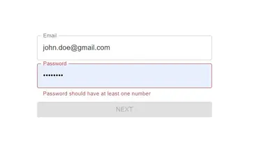
Now, we have validation however the Next buttons are still enabled.

Step 7: Disabling the Next buttons #
In this step, we'll disable the next button for Page1.tsx by accessing the formik context.
"use client"; import { Button } from "@mui/material"; import React from "react"; import { FormStepComponentType } from "@/components/signup/FormStepProps"; import FormikTextField from "../formik/FormikTextField"; import { useFormikContext } from "formik"; import { signupSchema } from "./signupSchema"; import { InferType } from "yup"; const Page1: FormStepComponentType = (props) => { const { errors } = useFormikContext<InferType<typeof signupSchema>>(); const hasErrors = errors.email || errors.password; return ( <div className="flex flex-col gap-2 w-[400px]"> <FormikTextField name="email" label="Email" /> <FormikTextField name="password" label="Password" type="password" /> <Button variant="contained" onClick={props.onNext} disabled={!!hasErrors}> Next </Button> </div> ); }; export default Page1;123456789101112131415161718192021222324
Explanation:
In line 11, we use the useFormikContext hook and provide a type parameter that matches our signupSchema. We use the InferType utility type provided by Yup to get exactly the type we want. When we don't provide a type parameter, calling errors.email or errors.password will result in a type-error.
In line 12, we just check if errors.email or errors.password is not empty and use the disabled prop for the button on line 17.
Now, when there's an error in that specific step, the next button is disabled.

For Page2.tsx, I'll leave that as your homework.
That's basically it!
Full Code #
The full code can be accessed at GitHub: jmarioste/react-multi-step-form-tutorial
Conclusion #
You learned how to create a dynamic multi-step form in React with the use of Formik, Yup, and MUI. These libraries really help a lot in implementation and development speed so I highly recommend you check them out.
If you like this tutorial, please leave a like or share this article. For future tutorials like this, please subscribe to our newsletter or follow me on GitHub.
Credits: Image by Thomas G. from Pixabay


