How to Create a React Drag-and-Drop File Upload Component

Jasser Mark Arioste

Hello, hustlers! In this tutorial, you'll learn how to implement a fully-featured React drag-and-drop upload component to upload files to a backend endpoint. We'll be using React and Tailwind CSS to add interactivity to our component and we'll use axios to track the progress when uploading. We'll use NextJS as our react framework of choice with Typescript for maintainability and readability.
Tutorial Objectives #
What you'll learn step-by-step:
- Learn how to Implement drop support for an HTML element using React
- Implement an upload progress feature to see the upload progress of large files.
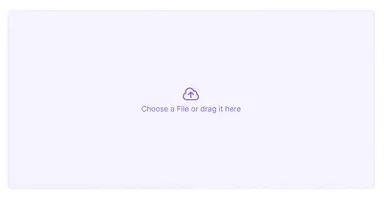
Final Output #
Here's our final output:

Step 1 - Project Setup #
This is an optional step if you already have an existing project but I'm going to include it just to add more clarity. We're going to start from scratch so let's create a new NextJS project. Run the following command:
npx create-next-app --ts --tailwind react-drag-and-drop-file-uploadThis will create a New NextJS project and preinstall Typescript and TailwindCSS. It will ask you some questions about your preferences like ESLint, etc.
After installation, you can run the local development environment by using the command:
cd react-drag-and-drop-file-upload
yarn dev
Step 2 - Installing Dependencies #
Next, let's install some packages that we'll be using in this project. We'll use @heroicons/react for some icons and classnames to organize TailwindCSS classes.
yarn add @heroicons/react classnames axiosStep 3 - Creating a Droppable File Upload Component #
In this step we'll first create our component without any user interaction, just the UI then add the drag-and-drop functionality afterward.
Step 3.1 - Implementing the UI
First, create the file components/FileUpload.tsx:
import React from "react"; import { CloudArrowUpIcon } from "@heroicons/react/24/outline"; import classNames from "classnames"; const FileUpload = () => { return ( <div className={classNames({ "w-full h-96": true, "p-4 grid place-content-center cursor-pointer": true, "bg-violet-50 text-violet-500 rounded-lg hover:bg-violet-100": true, "border-4 border-dashed border-violet-100 hover:border-violet-500": true, "transition-colors": true, })} > <div className="flex flex-col items-center"> <CloudArrowUpIcon className="w-10 h-10" /> <span> <span>Choose a File</span> or Drag it here </span> <input type="file" hidden /> </div> </div> ); }; export default FileUpload;1234567891011121314151617181920212223242526272829
Here we just have a div and style it using Tailwind. We use the classnames package to organize the classes so that it'll be easier to read.
Here's the output after this step:

Step 3.2 - Adding Drag-And-Drop Functionality
Next, let's add the ability to drop files to our component and store them in a local state. There are 4 events that you have to override to transform our div into a "droppable" element. These events are onDragEnter, onDragLeave, onDragOver, and onDrop. Below is a table of when these events occur:
| Event | Occurs when |
|---|---|
| onDragEnter | A dragged element enters the drop target |
| onDragLeave | A dragged element leaves the drop target |
| onDragOver | A dragged element is over the drop target |
| onDrop | A dragged element is dropped on the target |
Now, let's modify our component and add a little interactivity.
// components/FileUpload.tsx import React, { useRef, useState } from "react"; import { CloudArrowUpIcon } from "@heroicons/react/24/outline"; import classNames from "classnames"; const FileUpload = () => { const [fileList, setFileList] = useState<File[] | null>(null); const [shouldHighlight, setShouldHighlight] = useState(false); const preventDefaultHandler = (e: React.DragEvent<HTMLElement>) => { e.preventDefault(); e.stopPropagation(); }; return ( <div className={classNames({ "w-full h-96": true, "p-4 grid place-content-center cursor-pointer": true, "text-violet-500 rounded-lg": true, "border-4 border-dashed ": true, "transition-colors": true, "border-violet-500 bg-violet-100": shouldHighlight, "border-violet-100 bg-violet-50": !shouldHighlight, })} onDragOver={(e) => { preventDefaultHandler(e); setShouldHighlight(true); }} onDragEnter={(e) => { preventDefaultHandler(e); setShouldHighlight(true); }} onDragLeave={(e) => { preventDefaultHandler(e); setShouldHighlight(false); }} onDrop={(e) => { preventDefaultHandler(e); const files = Array.from(e.dataTransfer.files); setFileList(files); setShouldHighlight(false); }} > <div className="flex flex-col items-center"> {!fileList ? ( <> <CloudArrowUpIcon className="w-10 h-10" /> <span> <span>Choose a File</span> or drag it here </span> </> ) : ( <> <p>Files to Upload</p> {fileList.map((file, i) => { return <span key={i}>{file.name}</span>; })} <div className="flex gap-2 mt-2"> <button className="bg-violet-500 text-violet-50 px-2 py-1 rounded-md"> Upload </button> <button className="border border-violet-500 px-2 py-1 rounded-md" onClick={() => { setFileList(null); }} > Clear </button> </div> </> )} </div> </div> ); }; export default FileUpload;1234567891011121314151617181920212223242526272829303132333435363738394041424344454647484950515253545556575859606162636465666768697071727374757677
Here we're just adding some drag-over effects to the background and the border and then displaying the files when dropped. Here's the current output:

Step 4 - Implementing Upload Functionality #
In this step we'll implement upload functionality, I assume you already have a backend upload endpoint. We'll use axios so that it'll be easier to implement progress later on.
// ...
const FileUpload = () => {
  const [fileList, setFileList] = useState<File[] | null>(null);
  const [shouldHighlight, setShouldHighlight] = useState(false);

  const preventDefaultHandler = (e: React.DragEvent<HTMLElement>) => {
    e.preventDefault();
    e.stopPropagation();
  };

  const handleUpload = async () => {
    // const UPLOAD_URL = "YOUR URL HERE";
    const UPLOAD_URL = "/api/upload";
    const data = new FormData();
    for (let file of fileList!) {
      data.append(file.name, file);
    }
    await axios.post(UPLOAD_URL, data);
  };
  return (
    <div
      //...
    >
      <div className="flex flex-col items-center">
        {!fileList ? (
          <>
            ...
          </>
        ) : (
          <>
            <p>Files to Upload</p>
            {fileList.map((file, i) => {
              return <span key={i}>{file.name}</span>;
            })}
            <div className="flex gap-2 mt-2">
              <button
                className="bg-violet-500 text-violet-50 px-2 py-1 rounded-md"
                onClick={() => {
                  handleUpload();
                }}
              >
                Upload
              </button>
              <button
                className="border border-violet-500 px-2 py-1 rounded-md"
                onClick={() => {
                  setFileList(null);
                }}
              >
                Clear
              </button>
            </div>
          </>
        )}
      </div>
    </div>
  );
};

export default FileUpload;123456789101112131415161718192021222324252627282930313233343536373839404142434445464748495051525354555657585960
In lines 11-17, we define a callback function handleUpload to create the FormData from our fileList. We then use axios.post method to upload the FormData to our upload URL.
In lines 38-40, we add an onClick handler that calls the handleUpload function to start the upload. You can also modify this implementation to call the handleUpload on the onDrop event.
Step 6 - Implementing Progress #
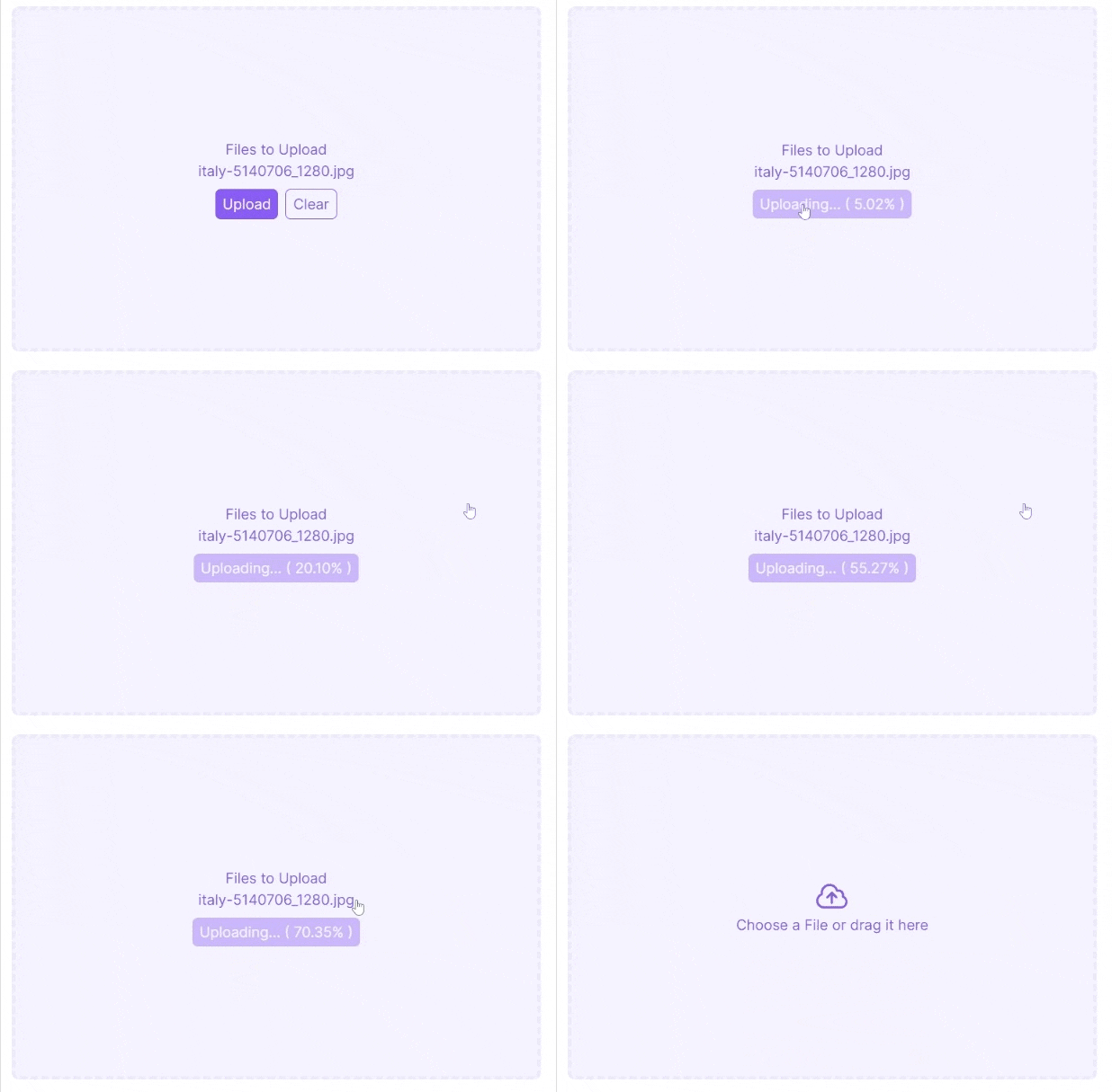
Next, we'll implement tracking of the upload progress for a better user experience. To track the upload progress in axios, we only have to define the onUploadProgress event and create a local state to track the progress. For example:
import React, { useRef, useState } from "react"; import { CloudArrowUpIcon } from "@heroicons/react/24/outline"; import classNames from "classnames"; import axios from "axios"; const FileUpload = () => { const [fileList, setFileList] = useState<File[] | null>(null); const [shouldHighlight, setShouldHighlight] = useState(false); const [progress, setProgress] = useState(0); // ... const handleUpload = async () => { // const UPLOAD_URL = "YOUR URL HERE"; const UPLOAD_URL = "/api/upload"; const data = new FormData(); for (let file of fileList!) { data.append(file.name, file); } await axios.post(UPLOAD_URL, data, { onUploadProgress(e) { const progress = e.progress ?? 0; setProgress(progress * 100); if (progress * 100 >= 100) { setFileList(null); } }, }); }; const uploading = progress > 0 && progress < 100; return ( <div ... > <div className="flex flex-col items-center"> {!fileList ? ( <> <CloudArrowUpIcon className="w-10 h-10" /> <span> <span>Choose a File</span> or drag it here </span> </> ) : ( <> <p>Files to Upload</p> {fileList.map((file, i) => { return <span key={i}>{file.name}</span>; })} <div className="flex gap-2 mt-2"> <button className={classNames({ "bg-violet-500 text-violet-50 px-2 py-1 rounded-md": true, "pointer-events-none opacity-40 w-full": uploading, })} onClick={() => { handleUpload(); }} > {uploading ? `Uploading... ( ${progress.toFixed(2)}% )` : "Upload"} </button> {!uploading && ( <button className="border border-violet-500 px-2 py-1 rounded-md" onClick={() => { setFileList(null); }} > Clear </button> )} </div> </> )} </div> </div> ); }; export default FileUpload;123456789101112131415161718192021222324252627282930313233343536373839404142434445464748495051525354555657585960616263646566676869707172737475767778
Explanation:
In line 8, we create a local state to track progress.
In lines 18-24, we define a callback for the onUploadProgress event of axios and update the states as necessary.
In line 27, we create a derived boolean state to track the uploading state.
In lines 50, 56-58, we update the UI according to the progress.
Here's the current output after this step:

That's basically it!
Full Code and Demo #
You can check the full code at Github: jmarioste/react-upload-drag-and-drop-tutorial
For the Demo, you can use the repo as a NextJS starter app and run it locally by running the command:
npx create-next-app -e https://github.com/jmarioste/react-upload-drag-and-drop-tutorial
cd react-upload-drag-and-drop-tutorial
yarn dev
Conclusion #
You learned how to create a file upload drag-and-drop component using React, TailwindCSS and axios. Using this tutorial, I hope that you'll be able to create your own drag-and-drop file upload component based on your specific project requirements.
If you like this tutorial, please leave a like or share this article. For future tutorials like this, please subscribe to our newsletter or follow me on GitHub.
Resources #
To read more on this:
Credits: Image by Petra from Pixabay


