How to Create a Custom Formik Dropdown Component

Jasser Mark Arioste

Hello hustlers! In this guide, you'll learn how to create a custom Formik Dropdown component using HeadlessUI, DaisyUI, and TailwindCSS.
To create a custom formik dropdown component, we'll first create a regular dropdown component and create a wrapper component to add the formik functionality.
What Makes a Good Dropdown? #
First, let's ask ourselves, what makes a good dropdown component? This will be our guide to implementing the component. For me, it should have the following:
- It should be written in Typescript for type safety. We'll use NextJS with Typescript to achieve this.
- The component should look professional. Here, We'll use DaisyUI + TailwindCSS to style the component.
- The component should be accessible and respond to keyboard input. We'll use HeadlessUI to easily create accessible components.
- It should use Typescript generics to accept any kind of value for the options. We'll create a generic component to achieve this.
You can add or remove requirements depending on your project or situation.
Final Output #
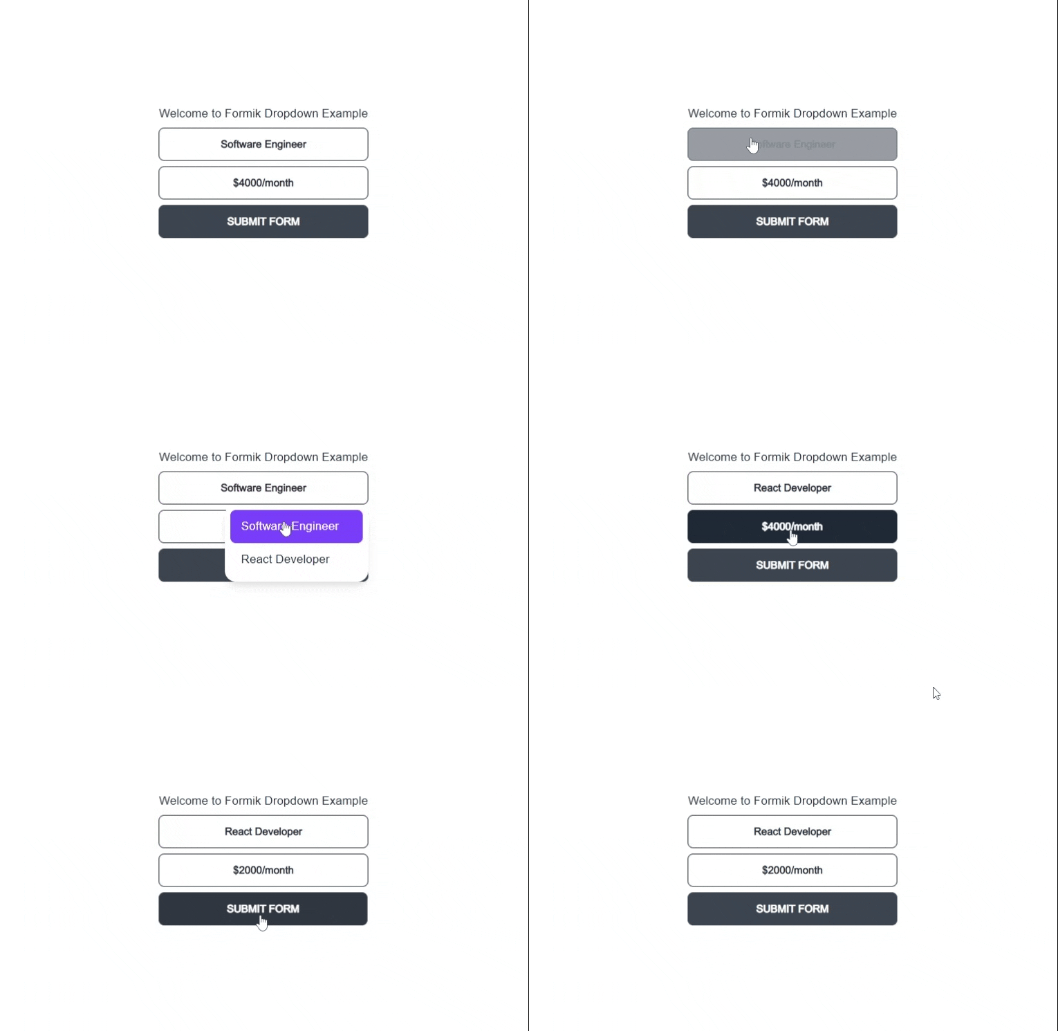
Here's a simple demo of the component we'll be making. You can also access the demo at Vercel.

Step 1 - Project Setup #
If you want to follow along step-by-step, I created a GitHub repo that includes all the dependencies: @headlessui/react, formik, daisyui, and tailwindcss. You can easily set up this NextJS command by using the commands:
npx create-next-app -e https://github.com/jmarioste/formik-dropdown-example formik-dropdown-example
cd formik-dropdown-example && yarn dev1
This will set up a local server in localhost:3000 where you'll be greeted by this screen:

Step 2 - Defining a Generic Dropdown Component #
Let's create a generic component so that our dropdown can hold any kind of value such as string, number, boolean or object.
First, create a file in components/CustomDropdown.tsx.
// components/CustomDropdown.tsx import React from "react"; const CustomDropdown = () => { return <div>CustomDropdown</div>; }; export default CustomDropdown;12345678
Next, Let's add the generic Props for our component:
import React from "react"; //👇 generic type for dropdown option export type CustomDropdownOption<T> = { label: string; value: T; }; //👇 generic props export type CustomDropdownProps<T> = { options: CustomDropdownOption<T>[]; value: T; onChange(value: T): void; }; //👇 generic dropdown component const CustomDropdown = <T,>(props: CustomDropdownProps<T>) => { return <div>CustomDropdown</div>; }; export default CustomDropdown;1234567891011121314151617
Now, we can use our dropdown component like the one below. Notice that the values for the options are different for each dropdown. This is the beauty of generic components:
// pages/index.tsx
import { NextPage } from "next";
import React from "react";
import { Inter } from "@next/font/google";
import CustomDropdown from "components/CustomDropdown";
const inter = Inter();
const HomePage: NextPage = () => {
  return (
    <div className={"container " + inter.className}>
      <div className="grid place-content-center min-h-screen">
        <div>
          <h1>Welcome to Formik Dropdown Example</h1>
          {/* 👇 Uses string type for the value */}
          <CustomDropdown
            options={[
              {
                label: "Software Engineer",
                value: "Software Engineer",
              },
              {
                label: "React Developer",
                value: "React Developer",
              },
            ]}
            value=""
            onChange={(value) => {
              console.log(value);
            }}
          />
          {/*👇 Uses number type for the value */}
          <CustomDropdown
            options={[
              {
                label: "$2000/month",
                value: 2000,
              },
              {
                label: "$4000/month",
                value: 4000,
              },
            ]}
            value={0}
            onChange={(value) => {
              console.log(value);
            }}
          />
        </div>
      </div>
    </div>
  );
};
export default HomePage;12345678910111213141516171819202122232425262728293031323334353637383940414243444546474849505152
If you want to know more about generic components, or useful patterns in react and typescript, check this guide by React Typescript Cheatsheet.
Step 3 - Adding Functionality using HeadlessUI #
Now that we've defined how to use the component, let's create the actual component itself. This will be simple since we have all the functionality we need using the HeadlessUI package.
// components/CustomDropdown.tsx
...
import { Listbox } from "@headlessui/react";
...
const CustomDropdown = <T,>(props: CustomDropdownProps<T>) => {
  const options = props.options;
  const selectedItem = options.find((o) => o.value === props.value);
  const label = selectedItem?.label ?? "Select Option...";
  return (
    <Listbox value={props.value} onChange={props.onChange}>
      <Listbox.Button>{label}</Listbox.Button>
      <Listbox.Options>
        {options.map((option, i) => (
          <Listbox.Option key={i} value={option.value}>
            {option.label}
          </Listbox.Option>
        ))}
      </Listbox.Options>
    </Listbox>
  );
};
...12345678910111213141516171819202122
Now, let's modify pages/index.tsx and add useState to track the value for each dropdown:
import React, { useState } from "react";
...
const HomePage: NextPage = () => {
  const [val, setVal] = useState("");
  const [val2, setVal2] = useState(0);
  return (
    ...
    <CustomDropdown
      options={[
        {
          label: "Software Engineer",
          value: "Software Engineer",
        },
        {
          label: "React Developer",
          value: "React Developer",
        },
      ]}
      value={val}
      onChange={(value) => {
        setVal(value);
      }}
    />
    <CustomDropdown
      options={[
        {
          label: "$2000/month",
          value: 2000,
        },
        {
          label: "$4000/month",
          value: 4000,
        },
      ]}
      value={val2}
      onChange={(value) => {
        setVal2(value);
      }}
    />;
    ...
  )
}
...12345678910111213141516171819202122232425262728293031323334353637383940414243
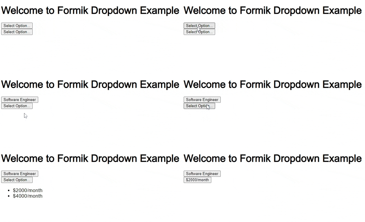
Here's what our component looks like after this step. It looks pretty bad but we got the basic functionality:

Step 4 - Adding Styling Using DaisyUI Classes #
Next, we'll be adding styling to our custom dropdown. We'll also use render props to access the state of the ListBox.Option component from HeadlessUI. The available state from render props for the ListBox is written in HeadlessUI docs:
// components/CustomDropdown.tsx ... import cn from "classnames"; ... import React from "react"; import { Listbox } from "@headlessui/react"; import cn from "classnames"; //👇 generic type for dropdown option export type CustomDropdownOption<T> = { label: string; value: T; }; //👇 generic props export type CustomDropdownProps<T> = { options: CustomDropdownOption<T>[]; value: T; onChange(value: T): void; }; //👇 generic dropdown component const CustomDropdown = <T,>(props: CustomDropdownProps<T>) => { const options = props.options; const selectedItem = options.find((o) => o.value === props.value); const label = selectedItem?.label ?? "Select Option..."; return ( <Listbox value={props.value} onChange={props.onChange} as={React.Fragment}> <div className={"dropdown dropdown-end w-full"}> {/* 👇 Classes for button */} <Listbox.Button className="btn btn-outline w-full relative no-animation normal-case"> {label} </Listbox.Button> {/* 👇 Classes for options */} <Listbox.Options className={cn({ "dropdown-content menu": true, "p-2 shadow-lg bg-base-100 rounded-box w-72": true, })} > {options.map((option, i) => ( <Listbox.Option key={i} value={option.value}> {/* 👇 Use render props to get active, disabled and selected state */} {({ active, disabled, selected }) => ( <button className={cn({ active: selected, "btn-disabled": disabled, "bg-primary/80 text-primary-content": active, })} > {option.label} </button> )} </Listbox.Option> ))} </Listbox.Options> </div> </Listbox> ); }; export default CustomDropdown;1234567891011121314151617181920212223242526272829303132333435363738394041424344454647484950515253545556575859
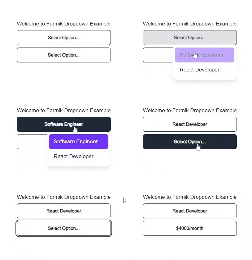
After this step, we get a beautiful custom dropdown component:

Step 5 - Adding Formik Functionality #
To integrate Formik into any component, we can use useFormikContext and useField custom hooks that are provided by Formik.
First, Create a file components/FormikCustomDropdown.tsx
// components/FormikCustomDropdown.tsx import { useField, useFormikContext } from "formik"; import React from "react"; import CustomDropdown, { CustomDropdownOption } from "./CustomDropdown"; type Props<T> = { name: string; options: CustomDropdownOption<T>[]; }; const FormikCustomDropdown = <T,>(props: Props<T>) => { const name = props.name; const [field] = useField<T>(name); const { setFieldValue } = useFormikContext(); // 👇 listen to any change in value and use setFieldValue // to modify the formik context state const handleChange = (val: T) => { setFieldValue(name, val); }; return ( <CustomDropdown options={props.options} onChange={handleChange} value={field.value} /> ); }; export default FormikCustomDropdown;1234567891011121314151617181920212223242526
Step 6 - Using the Custom Formik Dropdown #
To use the <FormikCustomDropdown/> component, we'll have to use the <Formik/> provider component. Let's modify our pages/index.tsx page to achieve this:
// pages/index.tsx import { NextPage } from "next"; import React from "react"; import FormikCustomDropdown from "components/FormikCustomDropdown"; import { Formik, Form } from "formik"; const HomePage: NextPage = () => { return ( <div className={"container"}> <div className="grid place-content-center min-h-screen"> <Formik onSubmit={(values) => alert(JSON.stringify(values, null, 4))} initialValues={{ position: "", salary: 0, }} > <Form className="flex flex-col gap-2"> <h1>Welcome to Formik Dropdown Example</h1> <FormikCustomDropdown name="position" options={[ { label: "Software Engineer", value: "Software Engineer", }, { label: "React Developer", value: "React Developer", }, ]} /> <FormikCustomDropdown name="salary" options={[ { label: "$2000/month", value: 2000, }, { label: "$4000/month", value: 4000, }, ]} /> <button className="btn" type="submit"> Submit Form </button> </Form> </Formik> </div> </div> ); }; export default HomePage;123456789101112131415161718192021222324252627282930313233343536373839404142434445464748495051525354
Explanation:
We no longer use the useState hook since the formik context provides all the states for the form.
We added a name prop to both <FormikCustomDropdown/> components to correspond to the initial state.
We also added a button to submit the form.
That's it!
Full Code and Demo #
The full code can be accessed at GiHub: jmarioste/formik-dropdown-example. The demo can be accessed at Vercel.
Conclusion #
We learned how to create a custom dropdown component using HeadlessUI and DaisyUI and integrate it into Formik by using Formik hooks.
If you like this tutorial, please leave a like or share this article. For future tutorials like this, please subscribe to our newsletter or follow me on Twitter.
Credits: Image by Pexels from Pixabay


