How to Create Dynamic DaisyUI Table with react-table Part 1

Jasser Mark Arioste

If you're tasked to create a dynamic table and your team is not using Material UI. You might think it would be difficult to implement a reusable dynamic table like that. But today in this tutorial, I will show you how to create a dynamic DaisyUI Table with the really awesome react-table library. This is Part 1 of a multi-part tutorial series regarding react-table and daisyui.
What is DaisyUI? #
DaisyUI is a high-level component library for tailwindcss. While tailwindcss uses low level classes, DaisyUI uses high level classes to build components, some examples are btn, modal, dropdown, badge, etc. We can still use the low level classes provided by tailwind if we want to tweak the components from daisyUI. I think that this combination of low-level classes (tailwind) + high-level classes (daisyUI) makes building components a lot faster and results in a more maintainable code.
What is react-table? #
ReactTable is an awesome lightweight and extensible data tables for react. It is headless (only custom hook), which means we have full control on how we design our tables. It has a lot of functionalities like filter, sort, group, aggregate, paginate etc.
In my opinion, one of the most important aspects of building software is flexibility and maintainability. We should be able to change the look of our components with whatever design we want whenever we want. Sometimes, using UI libraries like MaterialUI just hinders this because of its opinionated nature. With daisyUI + react-table, we can customize our table design and functionalities however we want while bringing minimal depenencies.
With that out of the way. Let's start building!
Step 0: Project Setup #
Let's create a new next.js project and Install the dependencies.
npx create-next-app --ts daisyui-table && cd daisyui-table1
Let's install DaisyUI into next.js
yarn add tailwindcss daisyui autoprefixer postcss1
Initialize tailwindcss
npx tailwindcss init -p1
Modify the generated tailwindcss.config.js and add content array to tell tailwind where our components are located. and add daisyui as one of the plugins:
/** @type {import('tailwindcss').Config} */
module.exports = {
  content: [
    "./pages/**/*.{js,ts,jsx,tsx}",
    "./components/**/*.{js,ts,jsx,tsx}",
  ],
  theme: {
    extend: {},
  },
  plugins: [require("daisyui")],
}1234567891011
Delete everything inside globals.css file and add tailwind utility classes.
#globals.css @tailwind base; @tailwind components; @tailwind utilities;1234
Modify index.tsx to make use of tailwind classes
//index.tsx

import type { NextPage } from "next";
import Head from "next/head";

const Home: NextPage = () => {
  return (
    <div className="container mx-auto">
      <Head>
        <title>Create Next App</title>
        <meta name="description" content="Generated by create next app" />
        <link rel="icon" href="/favicon.ico" />
      </Head>

      <main>
        <h1 className="text-2xl">
          Welcome to <a href="https://nextjs.org">Next.js!</a>
        </h1>
      </main>
    </div>
  );
};

export default Home;123456789101112131415161718192021222324
Run the project
yarn dev1
With that the setup is complete. Let's move onto the next steps
Step 2: Preparing the Table Data #
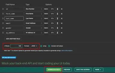
For the purposes of this tutorial, let's create a mock users data using mockaroo. Go to mockaroo.com and download the random user data that they have. This is the data that we're going to use for our table. Mockaroo is a great tool to quickly generate data for our table. Take note that for a real production application, you should get the data from your backend endpoints.
Make sure data is in JSON, then Click "Download Data"

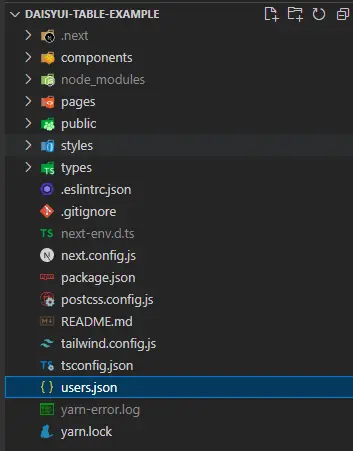
This will give us MOCK_DATA.json file. Let's rename MOCK_DATA.json file to users.json and paste it into our root project directory.

With all of those done, we are ready to create the table!
Step 3: Creating the Table #
Let's Install @tanstack/react-table package
yarn add @tanstack/react-table1
Defining the data schema type and column definitions.
Before we create the table component, Let's define the columns that we're going to use. First let's define the Person data and create a file: ./types/Person.ts
//types/Person.ts export type Person = { first_name: string; last_name: string; email: string; gender: string; ip_address: string; city: string; countryCode: string; };12345678910
Next, let's create the column definition that we will be using for our table. This column definition is where we define how to the get the value or render the cells, headers and sometimes footers for our table.
If we want to define a column in typescript, I reckon it's better to use the createColumnHelper function provided by react-table.
Let's see what this looks like and create a file ./components/UserColumnDefs.tsx
//./components/UserColumnDefs.tsx import { createColumnHelper } from "@tanstack/react-table"; import { Person } from "../types/Person"; // createColumnHelper helps us create columns with maximum type safety. // we assign the type person so that it knows the structure for our data const columnHelper = createColumnHelper<Person>(); export const userColumnDefs = [ columnHelper.accessor((row) => row.first_name, { id: "first_name", cell: (info) => info.getValue(), header: (info) => <span>First Name</span>, }), columnHelper.accessor((row) => row.last_name, { id: "last_name", cell: (info) => <span>{info.getValue()}</span>, header: () => <span>Last Name</span>, }), columnHelper.accessor((row) => row.gender, { id: "gender", cell: (info) => <span>{info.getValue()}</span>, header: () => <span>Gender</span>, }), columnHelper.accessor((row) => row.email, { id: "email", cell: (info) => <span>{info.getValue()}</span>, header: () => <span>Email</span>, }), columnHelper.accessor((row) => row.ip_address, { id: "ip_address", cell: (info) => <span>{info.getValue()}</span>, header: () => <span>IP Address</span>, }), ];1234567891011121314151617181920212223242526272829303132333435
With that we created column definitions for our table. But let's break down what it's actually doing.
//this arrow function is used for getting the value for the cell. It is going to be used for sorting and filtering.1
If we look at what row object is, we'll see that it is of type Person and intellisense is enabled.

//tells react-table how to render a specific cell. info.getValue() is based on what the arrow function above returns.1
//tells react-table how to render the header for this column.1
Creating the table component
Let's create an empty table component and add the subcomponents as we go along
//components/ClientSideTable.tsx
import { useReactTable, getCoreRowModel } from "@tanstack/react-table";
import data from "../users.json";
import React from "react";
import { userColumnDefs } from "./UserColumnDefs";

const ClientSideTable = () => {
  const table = useReactTable({
    columns: userColumnDefs,
    data: data ?? [],
    getCoreRowModel: getCoreRowModel(),
  });

  return (
    <div>
      <table className="table table-zebra my-4 w-full">
        <thead></thead>
        <tbody></tbody>
      </table>
    </div>
  );
};

export default ClientSideTable;123456789101112131415161718192021222324
Let's use this component in our index.tsx file.
import type { NextPage } from "next"; import ClientSideTable from "../components/ClientSideTable"; const Home: NextPage = () => { return ( <div className="container mx-auto"> <h1 className="text-2xl">React Table Demo</h1> <ClientSideTable /> </div> ); }; export default Home;12345678910111213
This will still result in an empty screen for now so next, let's implement the headers. Add the following code:
import {
  ...
  flexRender, //used for rendering values for cells and headers
} from "@tanstack/react-table";

const ClientSideTable = () => {
 ...
 const headers = table.getFlatHeaders();
 ...
 return (
  <div>
      <table className="table table-zebra my-4 w-full">
        <thead>
          <tr>
            {headers.map((header) => {
              return (
                <th key={header.id}>
                  {header.isPlaceholder ? null : (
                    <span>
                      {flexRender(
                        header.column.columnDef.header,
                        header.getContext()
                      )}
                    </span>
                  )}
                </th>
              );
            })}
          </tr>
        </thead>
        <tbody></tbody>
      </table>
    </div>
 )
}1234567891011121314151617181920212223242526272829303132333435
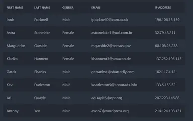
With this we've successfully rendered the headers in a daisyUI table.

Next, let's render the rows. Let's add the following code:
import {
  ...
  flexRender, //used for rendering values for cells and headers
} from "@tanstack/react-table";

const ClientSideTable = () => {
   ...
   const rows = table.getRowModel().rows;
   ...
   return (
    <div>
      <table className="table table-zebra my-4 w-full">
        <thead>
          ...
        </thead>
        <tbody>
          {rows.map((row) => (
            <tr key={row.id}>
              {row.getVisibleCells().map((cell) => (
                <td key={cell.id}>
                  {flexRender(cell.column.columnDef.cell, cell.getContext())}
                </td>
              ))}
            </tr>
          ))}
        </tbody>
      </table>
    </div>
  );
}123456789101112131415161718192021222324252627282930
Now, we've successfully rendered the rows. But it's still a bit lacking since it doesn't have sorting and pagination. We'll tackle that on Part 2 of this tutorial.

Conclusion #
We've successfully implemented a basic table using DaisyUI + react-table. Although it's a bit overkill to use react-table at this point since we cannot fully use it's full potential, we'll continue this in part 2 and part 3 for other exciting functionalities.
Resources #
DaisyUI Docs - https://daisyui.com/components/table/
React-Table Docs - https://tanstack.com/table/v8/docs/guide/introduction


