How to Set NextJS Images with auto Width and Height

Jasser Mark Arioste

Hello, hustler! In this tutorial, you'll learn how to set the NextJS images with auto width and height so that it depends on their container and layout. I'll give examples of how to do this on NextJS versions 12 and 13+.
Introduction #
Responsive grid layouts for images are pretty standard on the web today. We often have 3 or more columns on desktop, 3 columns on tablets, and 1 or 2 columns on mobile. However, when using the next/image component, it requires the width and height props. But we want the height and width of the images to be auto if we're using a responsive grid layout.
In this tutorial, we'll create a responsive grid layout that displays images with automatic width and height based on the parent element. We'll also use tailwind to use the utility classes it provides as a personal preference.
Final Output #
Here's the final output of what we will be making today:

Step 0 - Project Setup #
I created a NextJS starter template with TailwindCSS preinstalled to speed up the setup. Let's set up a new NextJS 13 project by running the command:
npx create-next-app -e https://github.com/jmarioste/next-tailwind-starter-2 next-image-tutorialOnce that's done, you can run the following command to start the development server:
cd next-image-tutorial
yarn dev
Step 1 - Creating a Responsive Grid Layout #
First, let's create a responsive grid layout component using Tailwind CSS. Modify your pages/index.tsx file to the code below:
// pages/index.tsx import type { NextPage } from "next"; const Home: NextPage = () => { const items = new Array(12).fill("x"); return ( <div className="m-2 grid grid-cols-12 gap-2"> {items.map((item, i) => { return ( <div key={i} className="col-span-6 md:col-span-4 lg:col-span-3 aspect-video w-full bg-gray-100" ></div> ); })} </div> ); }; export default Home;123456789101112131415161718
Explanation:
Line 4: We create an arbitrary array of items as a substitute for our images later.
Line 6: We define a 12-column grid layout using grid and grid-cols-12 classes from TailwindCSS.
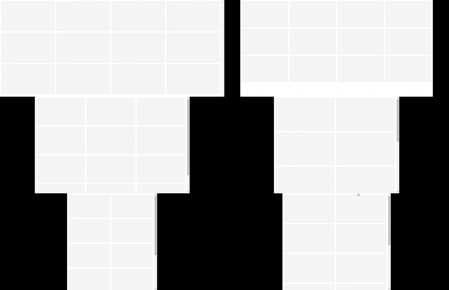
Line 11: We render each item as a rectangle with an aspect ratio of 16:9. We use col-span-* classes to set its column span across different screen sizes.
Once you're done with this, it should have a responsive grid layout like this:

Step 2 - Adding the responsive images #
Now that we have our layout, and the dimensions of the items already set. Let's use next/image component to fill in the gray boxes:
// pages/index.tsx import type { NextPage } from "next"; import Image from "next/image"; const Home: NextPage = () => { const items = new Array(12).fill("x"); return ( <div className="m-2 grid grid-cols-12 gap-2"> {items.map((item, i) => { const randomId = (Math.random() * 100).toFixed(0); return ( <div key={i} className="col-span-6 md:col-span-4 lg:col-span-3 aspect-video w-full bg-gray-100 relative" > <Image src={`https://picsum.photos/id/${randomId}/640/340`} fill className="object-cover" alt={`alt`} /> </div> ); })} </div> ); }; export default Home;12345678910111213141516171819202122232425262728
We are using random images from picsum.photos for the source URL. Let's not forget to add the domain in next.config.js:
// next.config.js /** @type {import('next').NextConfig} */ const nextConfig = { reactStrictMode: true, swcMinify: true, images: { domains: ["picsum.photos"], }, }; module.exports = nextConfig;1234567891011
Explanation:
Line 13: We add the relative class on the parent element. The relative class adds position:relative CSS to the element. This is a crucial step when we want auto width and height for our images.
Lines 17-18: We add the fill={true} property and object-cover class. When fill property is used with position:relative, it fills the container element with the image, and this automatically sets the width and height.
NextJS 12 Example:
On NextJS v12, we use the objectFit="cover" and layout="fill" properties as shown below:
<Image
  src={`https://picsum.photos/id/${randomId}/640/340`}
  objectFit="cover"
  layout="fill"
  alt={`alt`}
/>123456
Once you're done with this step. It should have the following outputs:


That's basically it!
Conclusion #
We learned how to set the width and height automatically when using the next/image component. The important thing to remember is, the parent element should have position:relative style and the Image component should have the fill or layout="fill" property.
If you like this tutorial, please leave a like or share this article. For future tutorials like this, please subscribe to our newsletter or follow me on Twitter.
Resources #
Credits: Image by Simon Berger from Pixabay


