How to Build a React OTP Input From Scratch Using DaisyUI

Jasser Mark Arioste

Today, we're going to build a react OTP input from scratch using DaisyUI. There are many ready-made OTP input packages out there but there are definitely benefits to building your own components. For one, you have complete control over the code and any customizations in the behavior. It also allows you to hone your skills.
Aside from that, I want to help beginner developers to think systematically when building components. One of the best traits of great developers is their problem-solving ability and the ability to make decisions when necessary.
By building components like these, you can improve your skills by leaps and bounds.
I use DaisyUI because it provides maximum flexibility with the styling. However, you can use any kind of styling library depending on your project. You can use pure TailwindCSS but it's a bit more verbose than just using DaisyUI.
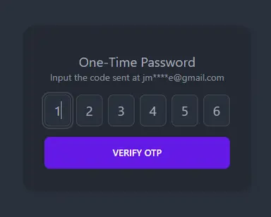
Final Output #
This is the final output of what we will be building.

Requirements / Specs / Limitations #
Here's a list of specs for the OTP Input component. This is a guide, so you can add or remove depending on your situation.
Functional Requirements
- It should be possible to override the number of characters for the OTP code. The default is 6 characters.
- It should be possible to set the validation pattern for each input.
- The inputs should be separated for each character.
- It should allow copy-paste. We should handle this since the input is separated
- Pressing the "Backspace" key should delete the value of the current input. It should also transfer the focus to the previous input if applicable.
- Each input should have a limit of 1 character.
- Mobile: It should automatically submit the form once an OTP SMS message is received. We'll be testing this after deployment.
Non-Functional Requirements
- Responsive. It should look good on mobile and desktop.
- Our code should use Typescript for maintainability and readability.
Cool. With that out of the way, let's start by setting up our project to use DaisyUI.
Project Setup #
We'll be using NextJS (with Typescript) as our React framework for this tutorial. So first, let's create a new project in NextJS.
npx create-next-app --ts1
To set up DaisyUI, you can follow my previous tutorial: "How to set up DaisyUI theme in NextJS". If you are using a different react framework for your project, please check the daisyUI installation docs for a specific example.
Building the OTP Input Component #
Let's create the file in components/OtpInput.tsx. Let's also define the props for our component:
// components/OtpInput.tsx

/**
 * Let's borrow some props from HTML "input". More info below:
 *
 * [Pick Documentation](https://www.typescriptlang.org/docs/handbook/utility-types.html#picktype-keys)
 *
 * [How to extend HTML Elements](https://reacthustle.com/blog/how-to-extend-html-elements-in-react-typescript)
 */
type PartialInputProps = Pick<
  React.ComponentPropsWithoutRef<"input">,
  "className" | "style"
>;

type Props = {
  /**
   * full value of the otp input, up to {size} characters
   */
  value: string;
  onChange(value: string): void;
  /**
   * Number of characters/input for this component
   */
  size?: number;
  /**
   * Validation pattern for each input.
   * e.g: /[0-9]{1}/ for digits only or /[0-9a-zA-Z]{1}/ for alphanumeric
   */
  validationPattern?: RegExp;
} & PartialInputProps;123456789101112131415161718192021222324252627282930
Next, let's define the component itself without any interactivity.
// components/OtpInput.tsx
...

const OtpInput = (props: Props) => {
  const {
    //Set the default size to 6 characters
    size = 6,
    //Default validation is digits
    validationPattern = /[0-9]{1}/,
    value,
    onChange,
    className,
    ...restProps
  } = props;

  // Create an array based on the size.
  const arr = new Array(size).fill("-");
  return (
    <div className="flex gap-2">
      {/* Map through the array and render input components */}
      {arr.map((_, index) => {
        return (
          <input
            key={index}
            {...restProps}
            /**
             * Add some styling to the input using daisyUI + tailwind.
             * Allows the user to override the className for a different styling
             */
            className={className || `input input-bordered px-0 text-center`}
            type="text"
            inputMode="numeric"
            autoComplete="one-time-code"
            pattern={validationPattern.source}
            maxLength={6}
            value={value.at(index) ?? ""}
          />
        );
      })}
    </div>
  );
};

export default OtpInput;1234567891011121314151617181920212223242526272829303132333435363738394041424344
A few things to note from the above code.
In order to provide the best user experience for SMS OTP for mobile, we use some properties in our input elements:
type="text"- It is better to use this instead of type="number" since that will produce a spinner at the left.inputMode="numeric"- transforms the mobile keypad into a numeric keypad.autoComplete="one-time-code"- Once the user receives an OTP code from SMS. This allows the browser to suggest an autocomplete for improved user experience.
Let's use our component on the index page and see what it looks like.
// pages/index.tsx import type { NextPage } from "next"; import { useState } from "react"; import OtpInput from "../components/OtpInputPartial"; const Home: NextPage = () => { const [otp, setOtp] = useState(""); return ( <div className="container"> <div className="h-screen grid place-content-center bg-base-100"> <OtpInput value={otp} onChange={(val) => { setOtp(val); }} /> </div> </div> ); }; export default Home;12345678910111213141516171819202122
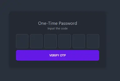
Our OTP Input component now looks like this. I'm using dark mode in my system that's why it uses a dark theme. Looks good already!

Adding Interactivity or Functionality #
Step 1: Allowing the user to type the code.
Let's allow the user to input his code by adding an onChange handler to our inputs.
// components/OtpInput.tsx

const OtpInput = (props: Props) => {
  ...

  const handleInputChange = (
    e: React.ChangeEvent<HTMLInputElement>,
    index: number
  ) => {
    const elem = e.target;
    const val = e.target.value;
    // check if the value is valid
    if (!validationPattern.test(val) && val !== "") return;

    // change the value of the upper state using onChange
    const valueArr = value.split("");
    valueArr[index] = val;
    const newVal = valueArr.join("").slice(0, 6);
    onChange(newVal);

    //focus the next element if there's a value
    if (val) {
      const next = elem.nextElementSibling as HTMLInputElement | null;
      next?.focus();
    }
  };

  return (
    <div className="flex gap-2">
      {arr.map((_, index) => {
        return (
          <input
            ...
            onChange={(e) => handleInputChange(e, index)}
          />
        );
      })}
    </div>
  );
};

export default OtpInput;123456789101112131415161718192021222324252627282930313233343536373839404142
Step 2: Improving accessibility
Currently, when the user hits the "Backspace", ArrowLeft" or "ArrowRight" keys, it doesn't do anything. Let's improve the user experience by adding an onKeyUp event handler:
...
const OtpInput = (props: Props) => {
  ...
  const handleKeyUp = (e: React.KeyboardEvent<HTMLInputElement>) => {
    const current = e.currentTarget;
    if (e.key === "ArrowLeft" || e.key === "Backspace") {
      const prev = current.previousElementSibling as HTMLInputElement | null;
      prev?.focus();
      prev?.setSelectionRange(0, 1);
      return;
    }

    if (e.key === "ArrowRight") {
      const prev = current.nextSibling as HTMLInputElement | null;
      prev?.focus();
      prev?.setSelectionRange(0, 1);
      return;
    }
  };
  return (
    <div className="flex gap-2">
      {/* Map through the array and render input components */}
      {arr.map((_, index) => {
        return (
          <input
            ...
            onKeyUp={handleKeyUp}
          />
        );
      })}
    </div>
}1234567891011121314151617181920212223242526272829303132
Here's a simple demo after the first two steps:

Step 3: Adding Copy-Paste Functionality
Since our inputs are separated, we have to modify the copy-paste functionality so that the copied text propagates to the other inputs.
...
const OtpInput = (props: Props) => {
  ...
  const handlePaste = (e: React.ClipboardEvent<HTMLInputElement>) => {
    e.preventDefault();
    const val = e.clipboardData.getData("text").substring(0, size);
    onChange(val);
  };

  return (
    <div className="flex gap-2">
      {/* Map through the array and render input components */}
      {arr.map((_, index) => {
        return (
          <input
            ...
            onPaste={handlePaste}
          />
        );
      })}
    </div>
}12345678910111213141516171819202122
Now copying some code and pasting it should

Allowing automatic form submission using WebOTP API #
We've already completed the functionality of the OTPInput component. Now, let us take it a step further by allowing mobile users to automatically submit the form when they receive an OTP SMS. Our mini-project won't be complete without this!
Step 4: Creating the OtpForm component
Let's create the file components/OtpForm.tsx
import React, { useState } from "react";
import OtpInput from "components/OtpInputPartial";

const OtpForm = () => {
  const [otp, setOtp] = useState("");

  return (
    <form
      className="card shadow-md bg-base-200"
      onSubmit={async (e) => {
        e.preventDefault();
      }}
    >
      <div className="card-body items-stretch text-center">
        <div className="my-2">
          <h2 className="text-xl"> One-Time Password</h2>
          <p className="text-sm text-base-content/80"> Input the code</p>
        </div>
        <OtpInput
          value={otp}
          onChange={(val) => {
            setOtp(val);
          }}
        />
        <button className="btn btn-primary mt-2" type="submit">
          Verify OTP
        </button>
      </div>
    </form>
  );
};

export default OtpForm;123456789101112131415161718192021222324252627282930313233
Now, let's use it on our index page (pages/index.tsx).
import type { NextPage } from "next"; import OtpForm from "components/OtpForm"; const Home: NextPage = () => { return ( <div className="container"> <div className="h-screen grid place-content-center bg-base-100"> <OtpForm /> </div> </div> ); }; export default Home;1234567891011121314
Looking good so far!

Step 5: Using the WebOTP API
Now that we have a form, let's add an auto-submit functionality using the WebOTP API. First, let's add the following to our OtpForm:
// components/OtpForm.tsx

const OtpForm = () => {
  const [otp, setOtp] = useState("");
  //Add a reference to our form so that we can use it later
  const ref = useRef<HTMLFormElement>(null!);

  useEffect(() => {
    // Feature detection
    if ("OTPCredential" in window) {
      const form = ref.current;
      //Allows us to cancel the web API if the form is submitted manually
      const ac = new AbortController();
      const handler = () => {
        ac.abort();
      };
      form.addEventListener("submit", handler);

      //Let the browser listen for any sms message containing an OTP code.
      navigator.credentials
        .get({
          // @ts-ignore
          otp: { transport: ["sms"] },
          signal: ac.signal,
        })
        .then((otp: any) => {
          //set the state and submit the form automatically
          setOtp(otp.code);
          form.submit();
        })
        .catch((err) => {
          console.log(err);
        });

      //Cleanup useEffect
      return () => {
        form.removeEventListener("submit", handler);
      };
    }
  }, []);

  //temporary handle submit function
  const handleSubmit = async (e: React.FormEvent) => {
    e.preventDefault();
    console.log("Submitting code to API");
  };

  ...
  return (
    <form
      className="card shadow-md bg-base-200"
      onSubmit={handleSubmit}
      ref={ref}
    >
    ...
    </form>
  )
}12345678910111213141516171819202122232425262728293031323334353637383940414243444546474849505152535455565758
There's a lot going on here so let's break it down step-by-step:
Feature Detection
useEffect(() => {
    // Feature detection
    if ("OTPCredential" in window) {
        ...
    }
}, [])123456
This is pretty self-explanatory. It checks if the browser can parse OTP SMS messages by checking the OTPCredential class.
Aborting the message on manual Submit
//Allows us to cancel the web API if the form is submitted manually
const ac = new AbortController();
const handler = () => {
  ac.abort();
};
form.addEventListener("submit", handler);1234567
If the user wishes to manually input the code and submit, this allows us to cancel the .get() function if the form is submitted manually. More info on AbortController.
Triggering the Browser Permissions
navigator.credentials
  .get({
    // @ts-ignore
    otp: { transport: ["sms"] },
    signal: ac.signal,
  })1234567
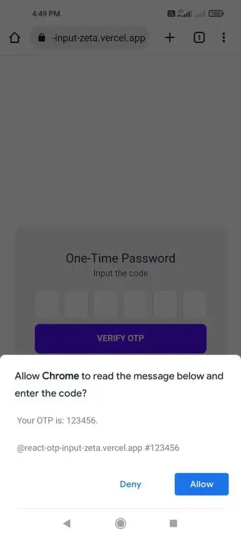
This triggers the browser permissions to allow it to read the SMS message once it arrives. More info is available here.
For example:

Processing the Message
Once the browser gets the OTP code, it returns an OTPCredential object. It has a code property which we'll use to set our otp state in react and submit the form.
        ...
        .then((otp: any) => {
          //set the state and submit the form automatically
          setOtp(otp.code);
          form.submit();
        })
        .catch((err) => {
          console.log(err);
        });
        ...12345678910
Wiring it all together
Now we just need to add a submit handler for our form. You can do anything here depending on your application. Once you verify the code, you can show a message or redirect the user, create a session, etc. It depends on your requirements.
  ...
  //temporary handle submit function
  const handleSubmit = async (e: React.FormEvent) => {
    e.preventDefault();
    console.log("Submitting code to API");
  };

  ...
  return (
    <form
      className="card shadow-md bg-base-200"
      onSubmit={handleSubmit}
      ref={ref}
    >
    ...
    </form>
  )1234567891011121314151617
In my case, I implemented an API route to verify the otp code and called it from the handleSubmit function. Below is an example
Implementing a mock verify-otp API
This is a very crude API implementation and it's for example purposes only.
// pages/api/verify-otp.ts import type { NextApiRequest, NextApiResponse } from "next"; export default function handler(req: NextApiRequest, res: NextApiResponse) { if (req.method === "POST") { const code = req.body.code; console.log(req.body, req.body.code); if (code === "123456") { res.status(200).json({ success: true }); } else { res.status(401).json({ success: false, message: "invalid code" }); } } else { res.status(405).send("Method not allowed"); } res.end(); }123456789101112131415161718
Using the verify-otp API onSubmit
// components/OtpForm.tsx
...
import classNames from "classnames";

const OtpForm = () => {
  ...
  const [submitting, setSubmitting] = useState(false);
  const [message, setMessage] = useState("");
  ...
  const handleSubmit = async (e: React.FormEvent) => {
    e.preventDefault();
    setSubmitting(true);
    try {
      const response = await fetch(`/api/verify-otp`, {
        headers: {
          Accept: "application/json",
          "Content-Type": "application/json",
        },
        method: "POST",
        body: JSON.stringify({ code: otp }),
      });
      type Result = {
        success: boolean;
        message?: string;
      };
      const result: Result = await response.json();
      setSubmitting(false);
      if (result.success) {
        setMessage("You are now verified.");
      } else {
        setMessage(result.message ?? "Invalid code");
        setOtp("");
      }
    } catch (e) {
      if (e instanceof Error) {
        alert(e.message);
      }
    } finally {
      setSubmitting(false);
    }
  };

  if (message) {
    return (
      <div className="flex flex-col items-stretch gap-2">
        <p className="text-xl">{message}</p>
        <button
          onClick={() => {
            setMessage("");
            setOtp("");
          }}
          className="btn btn-primary"
        >
          Reset Form
        </button>
      </div>
    );
  }
    return (
    <form
       ...
    >
      <div className="card-body items-stretch text-center">
        ...
        <button
          className={classNames({
            "btn btn-primary": true,
            loading: submitting,
          })}
          type="submit"
        >
          Verify OTP
        </button>
      </div>
    </form>
  );
}1234567891011121314151617181920212223242526272829303132333435363738394041424344454647484950515253545556575859606162636465666768697071727374757677
The above code is pretty straightforward. In the handleSubmit function, we just call the API and set the appropriate message depending on the result. But it totally depends on you what to do here. You can also redirect the user to another page if the code is valid.
Now code is complete, we can test if our React OTP Input works. You can check the full code here: https://github.com/jmarioste/react-otp-input
Manual Testing #
To test the WebOTP functionality, we have to deploy it since the WebOTP is only available through HTTPS. I deployed the app in Vercel: https://react-otp-input-zeta.vercel.app/
Next, you can go to the app and you can send a test OTP code to your phone number. Send the message below to your phone number:
Your OTP is: 123456.

@react-otp-input-zeta.vercel.app #12345612
Once you receive the message, it should automatically submit the form and show you this screen:

If you input an incorrect code, it shows you this screen:

Conclusion #
We learned how to build a React OTP Input component as well as the best practices for web otp and accessibility. We also learned how to use the WebOTP API to automatically submit the OTP code once the browser receives an SMS message.
If you like this tutorial, please leave a like or share this article. For future tutorials like this, please subscribe to our newsletter or follow me on Twitter.
Resources / Further Reading #
SMS OTP form best practices - https://web.dev/sms-otp-form/
Verify phone numbers on the web with the WebOTP API - https://web.dev/web-otp/
DaisyUI Docs - https://daisyui.com/docs/install/
Full code: https://github.com/jmarioste/react-otp-input
Deployed App: https://react-otp-input-zeta.vercel.app/


