How to implement a React autocomplete input using DaisyUI

Jasser Mark Arioste

Hello, hustlers! In this tutorial you will will learn how to create a autocomplete search component in React using DaisyUI for styling.

What is DaisyUI? #
DaisyUI is an amazing library of components. It retains the optimization for tailwind which only includes the CSS that are used by the application, and it makes it easy to create button components without adding too many classes to our html. Any modifications to the current design is easily customizable using the standard TailwindCSS utility classes.
DaisyUI has a lot of components in its belt however it lacks components which require some JavaScript control. In this tutorial I'll share how to implement a search auto complete component by using existing DaisyUI components like input, button, dropdown.
Scope: What are the requirements for autocomplete input component. #
Let's define our scope and requirements first to have a general idea of the functionality of the search autocomplete component.
- It's primary use will be inside some form element, so that the user will be guided of the possible choices.
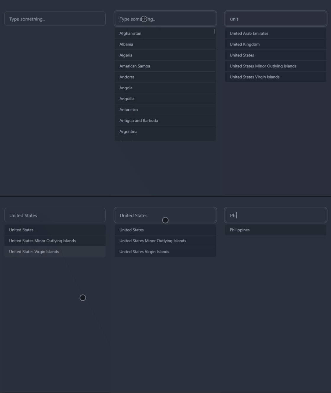
- If there is no input, the component should show a dropdown that contains a list of choices.
- Once the user starts typing, the dropdown list will be modified and the user can select which item he wants from the dropdown list.
Scenario: You need to implement an autocomplete to choose a country. #
First we have to create a generic autocomplete that accepts a generic parameters like items, values and onChange. Next step is to create a container component that handles the logic of showing the suggested list.
Step 0: Project setup #
We'll be using next.js as our framework and for setting up TailwindCSS and DaisyUI with next.js you may check my previous post: How to Set up DaisyUI theme with NextJS. That tutorial includes theming but you can skip that part. You don't really need next.js to follow along in this tutorial as long as DaisyUI is working in your project. It can be create-react-app and other frameworks too.
Step 1: Implement the input component #
To implement the autocomplete input we can break down the different components inside the autocomplete input.
- Input where the user types something
- A dropdown list where the user can choose from
First we will implement an input component and wrap it in the dropdown component using daisy ui. Create a components folder at the root directory of your project folder and add a file called Autocomplete.tsx
#./components/Autocomplete.tsx import React from "react"; type Props = { items: string[]; value: string; onChange(val: string): void; }; const Autocomplete = (props: Props) => { const { value, onChange } = props; return ( <div className={"dropdown dropdown-end w-full"}> <input type="text" className="input input-bordered w-full" value={value} onChange={(e) => onChange(e.target.value)} placeholder="Type something..." tabIndex={0} /> </div> ); }; export default Autocomplete;1234567891011121314151617181920212223242526
Step 2: Implement the dropdown component #
The dropdown component will be show/hide when the user types something.
But first Let's add classnames package to to easily organize our classes in tailwind
yarn add classnames1
Let's add the dropdown
//./components/Autocomplete.tsx import classNames from "classnames"; import React, { memo, useRef, useState } from "react"; type Props = { items: string[]; value: string; onChange(val: string): void; }; //we are using dropdown, input and menu component from daisyui const Autocomplete = (props: Props) => { const { items, value, onChange } = props; const ref = useRef<HTMLDivElement>(null); const [open, setOpen] = useState(false); return ( <div // use classnames here to easily toggle dropdown open className={classNames({ "dropdown w-full": true, "dropdown-open": open, })} ref={ref} > <input type="text" className="input input-bordered w-full" value={value} onChange={(e) => onChange(e.target.value)} placeholder="Type something.." tabIndex={0} /> {/* add this part */} <div className="dropdown-content bg-base-200 top-14 max-h-96 overflow-auto flex-col rounded-md"> <ul className="menu menu-compact " // use ref to calculate the width of parent style={{ width: ref.current?.clientWidth }} > {items.map((item, index) => { return ( <li key={index} tabIndex={index + 1} onClick={() => { onChange(item); setOpen(false); }} className="border-b border-b-base-content/10 w-full" > <button>{item}</button> </li> ); })} </ul> {/* add this part */} </div> </div> ); }; export default memo(Autocomplete);123456789101112131415161718192021222324252627282930313233343536373839404142434445464748495051525354555657585960616263
We have completed a very simple generic autocomplete implementation. Good job. Now let's use it and see what it looks like.
//./pages/index.tsx import React, { memo, useState } from "react"; import Autocomplete from "../components/auto-complete/Autocomplete"; const IndexPage = () => { const [value, setValue] = useState(""); //a list of countries to show the dropdown const countries = ["Africa", "Armenia", "Canada", "United States"]; return ( <div className="container mx-auto px-4"> <div className="py-10"> <Autocomplete value={value} onChange={setValue} items={countries} /> </div> </div> ); }; export default memo(IndexPage);12345678910111213141516171819
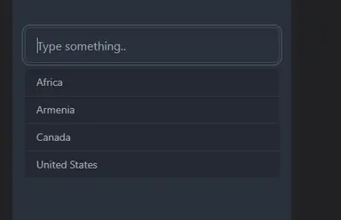
Lets see what it looks like! After all that code, you should have something like this component. Pretty cool!

Step 3: Create a container component to handle the logic #
Let's create a "container/smart" component that handles the logic for the "dumb" component. Were going to use restcountries.com api to get a list of all the countries.
Let's start by creating a file called CountriesAutoComplete.tsx and copy-paste the code below
//./components/CountriesAutoComplete.tsx import React, { useEffect, useState } from "react"; import Autocomplete from "./Autocomplete"; //return type for restcountries.com api. //do this for the static type checking. very important! type Country = { name: { common: string; }; }; const CountriesAutocomplete = () => { //query typed by user const [val, setVal] = useState(""); //a list to hold all the countries const [countries, setCountries] = useState<string[]>([]); //a list to show on the dropdown when user types const [items, setItems] = useState<string[]>([]); //query rest countries api and set the countries list useEffect(() => { async function fetchData() { const url = "https://restcountries.com/v3.1/all?fields=name"; const response = await fetch(url); const countries = (await response.json()) as Country[]; const newItems = countries.map((p) => p.name.common).sort(); setCountries(newItems); } fetchData(); }, []); useEffect(() => { //if there is no value, return the countries list. if (!val) { setItems(countries); return; } //if the val changes, we filter items so that it can be filtered. and set it as new state const newItems = countries .filter((p) => p.toLowerCase().includes(val.toLowerCase())) .sort(); setItems(newItems); }, [countries, val]); //use the common auto complete component here. return <Autocomplete items={items} value={val} onChange={setVal} />; }; export default CountriesAutocomplete;12345678910111213141516171819202122232425262728293031323334353637383940414243444546474849505152535455
Conclusion #
We've implemented a very simple yet elegant, fully functioning autocomplete component using very few dependencies. It's very maintainable, flexible and simple. This is what I like about DaisyUI and tailwindCSS when compared to big libraries like Material UI.
Resources #
Code is available here: https://github.com/jmarioste/setup-urql-nextjs/tree/auto-complete-input
Link to demo is available here: https://setup-urql-nextjs-8vb63ml3s-jmarioste.vercel.app/autocomplete
DaisyUI Docs: https://daisyui.com/docs/install/
Credits:
Image by Andy Bay from Pixabay


