How to Implement Show/Hide Password Toggle In React

Jasser Mark Arioste

Hello! In this tutorial, you'll learn how to implement a simple show/hide password toggle input in React. First, you'll start with a simple example, and in the next examples, you'll use MUI and TailwindCSS.
Introduction #
Show/Hide password is a very common feature in login forms and sign-up forms. It improves the user experience by allowing the user to show their password before submitting a login or sign-up form. But how do we exactly implement this in React? In short, it's basically changing the input type from "text" to "password" or vice-versa, depending on the state of the component.
Tutorial Objectives #
By the end of this tutorial, you'll learn the following:
- Create a show/hide password toggle without any styling
- Create a show/hide password toggle with MUI
- Create a show/hide password toggle when using React + TailwindCSS
Final Output #
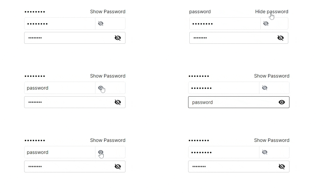
Here's the final output:

Example 1: Plain Implementation #
In this example, you'll create a <PasswordInput/> component without any styling. Once you learn to implement this basic component, it will be easy to implement when using a UI component library such as MUI.
First, create the file components/PasswordInput.tsx:
"use client"; import { ComponentPropsWithRef, useState } from "react"; type Props = ComponentPropsWithRef<"input">; const PasswordInput = (props: Props) => { // create a boolean state `shown` using useState hook const [shown, setShown] = useState(false); // create a derived state for the input type const type = shown ? "text" : "password"; // create a derived/computed state for the button text const buttonText = shown ? "Hide password" : "Show Password"; return ( <div> <input {...props} type={type} /> {/* toggle the state on click */} <button onClick={() => setShown(!shown)}>{buttonText}</button> </div> ); }; export default PasswordInput;1234567891011121314151617181920
Explanation:
First of all, we're using Typescript for this example so if you're using Javascript, just remove the type annotations..
In line 7, we define the shown state to get a hold of the current state of the <PasswordInput/> component.
In line 8, we set the input type to "text" or "password" depending on whether the password is shown or not. If the password is shown, we use text. Otherwise, use password.
In line 16, we attach an onClick handler to toggle the shown state.
After this step, you should have this output:

Example 2: Using TailwindCSS #
This step is definitely optional but we'll just add some styling using TailwindCSS. So first, install Tailwind CSS in your React application by following the installation instructions.
For the icons, I opted to use heroicons since they are made by the makers of TailwindCSS. Although, you can choose any icon package you like. Install heroicons by using the command:
#yarn
yarn add @heroicons/react
#npm
npm i @heroicons/react
Below is the implementation using tailwind and heroicons.
"use client"; import { ComponentPropsWithRef, useState } from "react"; import { EyeIcon, EyeSlashIcon } from "@heroicons/react/24/solid"; type Props = ComponentPropsWithRef<"input">; const PasswordInputTailwind = (props: Props) => { const [shown, setShown] = useState(false); const type = shown ? "text" : "password"; const Icon = shown ? EyeIcon : EyeSlashIcon; return ( <div className="border flex items-center in rounded-md overflow-hidden"> <input {...props} type={type} className="p-2 border-r outline-none" /> <button onClick={() => setShown(!shown)} className="p-2 "> <Icon className="w-5 h-5 text-gray-500" /> </button> </div> ); }; export default PasswordInputTailwind;123456789101112131415161718
It's basically just the same code but with a different styling. Here's the output:

Example 3: Using MUI #
In this example, you'll use MUI to create the PasswordInput component. Since it's a component library, it has a slightly different implementation from the first two examples.
First, let's install it by invoking the commands:
yarn add npm install @mui/material @emotion/react @emotion/styled
# if you want to use mui icons
yarn add @mui/icons-material
This is a separate component so next, create the file components/PasswordInputMUI.tsx:
"use client"; import { Visibility, VisibilityOff } from "@mui/icons-material"; import { TextField, TextFieldProps } from "@mui/material"; import { useState } from "react"; type Props = {} & TextFieldProps; const PasswordInputMUI = (props: Props) => { const [shown, setShown] = useState(false); const type = shown ? "text" : "password"; const Icon = shown ? Visibility : VisibilityOff; return ( <TextField {...props} type={type} InputProps={{ endAdornment: <Icon onClick={() => setShown(!shown)} /> }} /> ); }; export default PasswordInputMUI;12345678910111213141516171819
For MUI, we use the InputProps.endAdornment property to attach the icon at the end of the input.
Here's the output:

That's basically it!
Full Code and Demo #
The full code can be accessed at GitHub: jmarioste/show-hide-password-react-tutorial
The demo can be accessed at Stackblitz: Show Hide Password React Tutorial.
Conclusion #
You learned how to implement the show/hide password toggle feature in React.
If you like this tutorial, please leave a like or share this article. For future tutorials like this, please subscribe to our newsletter or follow me on GitHub.
Credits: Image by Valter from Pixabay


