How to Create a Responsive Tailwind Sidebar Layout in NextJS 12

Jasser Mark Arioste

Hello, hustlers! In this tutorial, you'll learn how to create a beautiful responsive and sticky sidebar in NextJS using TailwindCSS, React and Typescript.
Introduction #
Recently, I tried creating a sidebar in react-bootstrap but it was really a pain to customize. The problem is that in bootstrap they only have the horizontal navbar. If you decide to use it, you'll have to target specific CSS hierarchies to change the style, and you'll have to integrate it into NextJS. If you don't use it, might as well not use bootstrap at all.
All right, I thought that this would take a lot of time so I decided to use TailwindCSS instead. By using TailwindCSS, we have complete control over the elements. And since we use React to handle the states, we don't have to use 3rd-party libraries where we have little control over the behavior. It's also much easier to integrate it into NextJS since we only use HTML and CSS.
Final Output #
Here's the final output for the responsive sidebar component. It's an attempt to clone sidebar layouts from TailwindUI.
Desktop Layout

The sidebar is fixed on the desktop version.
Mobile Layout
Here's the final output for the mobile version
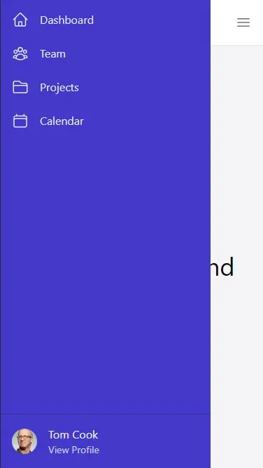
This seems simple, but it's quite tricky since on mobile the sidebar is on top of everything. We'll also need to adjust its height on desktop and the grid layout for different viewports. In this tutorial, we'll see how to solve this problem.
Now that we know everything we need to know. Let's proceed with the implementation!
Step 0 - Project Setup #
First, let's set up our project by creating a new NextJS app.
npx create-next-app --ts nextjs-tailwind-sidebarNext, let's install Tailwind CSS and all the other dependencies that we'll be needing in this tutorial. Run the commands:
# yarn
cd nextjs-tailwind-sidebar
yarn add -D tailwindcss postcss autoprefixer
yarn add @heroicons/react classnames usehooks-ts

#npm
cd nextjs-tailwind-sidebar
npm i -D tailwindcss postcss autoprefixer
npm i @heroicons/react classnames usehooks-ts
We'll use @heroicons/react for the sidebar icons, classnames package for organizing the tailwind classes and readability, and usehooks-ts for implementing click-outside functionality.
Next, let's quickly set up TailwindCSS for NextJS. Run the following command:
npx tailwindcss init -pNext, configure tailwind.config.js and copy the following code:
/** @type {import('tailwindcss').Config} */
module.exports = {
  content: [
    "./app/**/*.{js,ts,jsx,tsx}",
    "./pages/**/*.{js,ts,jsx,tsx}",
    "./components/**/*.{js,ts,jsx,tsx}",
  ],
  theme: {
    extend: {},
  },
  plugins: [],
}123456789101112
Next, modify styles/globals.css file and add the tailwind directives:
# styles/globals.css
@tailwind base;
@tailwind components;
@tailwind utilities;1234
Step 1 - Creating the Layout Component #
In this tutorial, we'll be using the grid CSS layout in our components. First, let's modify tailwind.config.js. We'll add two new classes: grid-cols-* and grid-rows-*. Since we need specific pixels for the navbar height and sidebar width, we can't rely on the default utility classes on tailwind.
/** @type {import('tailwindcss').Config} */
module.exports = {
  content: [
    "./app/**/*.{js,ts,jsx,tsx}",
    "./pages/**/*.{js,ts,jsx,tsx}",
    "./components/**/*.{js,ts,jsx,tsx}",
  ],
  theme: {
    extend: {
      gridTemplateColumns: {
        sidebar: "300px auto", // 👈 for sidebar layout. adds grid-cols-sidebar class
      },
      gridTemplateRows: {
        header: "64px auto", // 👈 for the navbar layout. adds grid-rows-header class
      },
    },
  },
};123456789101112131415161718
If you installed the TailwindCSS extension in VSCode, you should see grid-cols-sidebar and grid-rows-header classes on IntelliSense:
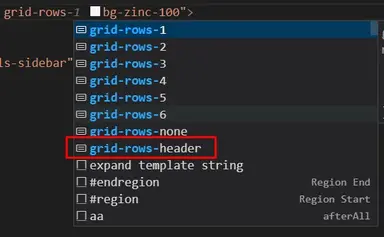
Next, let's create a Layout component. Create the file components/layout/Layout.tsx:
// components/layout/Layout.tsx import React, { PropsWithChildren } from "react"; const Layout = (props: PropsWithChildren) => { return ( <div className="grid min-h-screen grid-rows-header bg-zinc-100"> <div>Navbar</div> <div className="grid md:grid-cols-sidebar"> <div>Sidebar</div> {props.children} </div> </div> ); }; export default Layout;123456789101112131415
It uses the two classes we made earlier. For grid-cols-sidebar class, we only use it on the medium breakpoints and up. We don't need it on small devices since we'll use the position:fixed style on small devices.
Now, let's use it on pages/_app.tsx:
// pages/_app.tsx import "../styles/globals.css"; import type { AppProps } from "next/app"; import Layout from "components/layout/Layout"; function MyApp({ Component, pageProps }: AppProps) { return ( <Layout> <Component {...pageProps} />; </Layout> ); } export default MyApp;123456789101112
After this step, It looks like this on desktop:
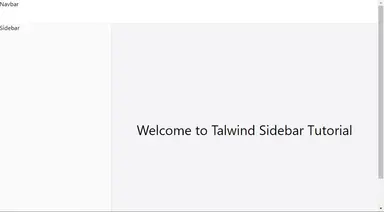
If you check the output on mobile devices, it still looks terrible. We'll fix this later once we create the next components.
Step 2 - Creating the Navbar Component #
Next, we'll create a simple Navbar/Header component. that has a menu button to hide/show the sidebar on mobile devices:
Create the file components/layout/Navbar.tsx:
// components/layout/Navbar.tsx import React from "react"; import { Bars3Icon } from "@heroicons/react/24/outline"; import classNames from "classnames"; type Props = { onMenuButtonClick(): void; }; const Navbar = (props: Props) => { return ( <nav className={classNames({ "bg-white text-zinc-500": true, // colors "flex items-center": true, // layout "w-full fixed z-10 px-4 shadow-sm h-16": true, //positioning & styling })} > <div className="font-bold text-lg">My Logo</div> <div className="flex-grow"></div> {/** spacer */} <button className="md:hidden" onClick={props.onMenuButtonClick}> <Bars3Icon className="h-6 w-6" /> </button> </nav> ); }; export default Navbar;12345678910111213141516171819202122232425
We just style the navbar according to our preferences and add a click handler for the menu button to toggle the sidebar. Let's use it on the <Layout/> component:
import React, { PropsWithChildren, useState } from "react"; import Navbar from "./Navbar"; const Layout = (props: PropsWithChildren) => { const [showSidebar, setShowSidebar] = useState(false); return ( <div className="grid min-h-screen grid-rows-header bg-zinc-100"> <div className="bg-white shadow-sm z-10"> <Navbar onMenuButtonClick={() => setShowSidebar((prev) => !prev)} /> </div> <div className="grid md:grid-cols-sidebar "> <div className="shadow-md bg-zinc-50">Sidebar</div> {props.children} </div> </div> ); }; export default Layout;123456789101112131415161718
After this step, you'll have this output on desktop:
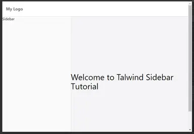
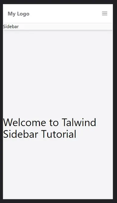
And on mobile you'll see a menu button that doesn't do anything for now:
Step 3 - Creating the Sidebar Component #
Next, let's create the <Sidebar/> component. First, we'll start with the bare minimum functionality. We'll also make it responsive on mobile and desktop, and make it hide/show on mobile. We'll add the links and other functionality later after this step.
Create the file component/layout/Sidebar.tsx:
import React from "react"; import classNames from "classnames"; type Props = { open: boolean; setOpen(open: boolean): void; }; const Sidebar = ({ open, setOpen }: Props) => { return ( <div className={classNames({ "flex flex-col justify-between": true, // layout "bg-indigo-700 text-zinc-50": true, // colors "md:w-full md:sticky md:top-16 md:z-0 top-0 z-20 fixed": true, // positioning "md:h-[calc(100vh_-_64px)] h-full w-[300px]": true, // for height and width "transition-transform .3s ease-in-out md:translate-x-0": true, //animations "-translate-x-full ": !open, //hide sidebar to the left when closed })} > <nav className="md:sticky top-0 md:top-16"> {/* nav items */} <ul className="py-2 flex flex-col gap-2"> <li>links here</li> </ul> </nav> </div> ); }; export default Sidebar;12345678910111213141516171819202122232425262728
Explanation:
Lines 4-5: Since the state is handled by the <Layout/> component, we define the props for the sidebar. We need the open state and setOpen function to hide/show the sidebar inside the <Sidebar/> component.
Line 13: Notice that we use fixed as the default position for mobile devices. We use md:sticky for desktop devices. Also for mobile, we use z-20 (z-index:20) so that it's on top of the navbar.
Line 14: We adjust the height of the sidebar according to the screen size. For mobile, it takes full height. For desktop devices, it takes full height minus 64px.
Lines 15-16: We use -translate-x-full to completely hide the sidebar to the left of the screen on mobile. If the sidebar is open, we remove this class. For desktop devices, we don't care about the state so we just set md:translate-x-0 to set it in place.
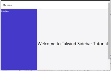
After this step, you got something like this on desktop devices, It looks the same as the previous step:
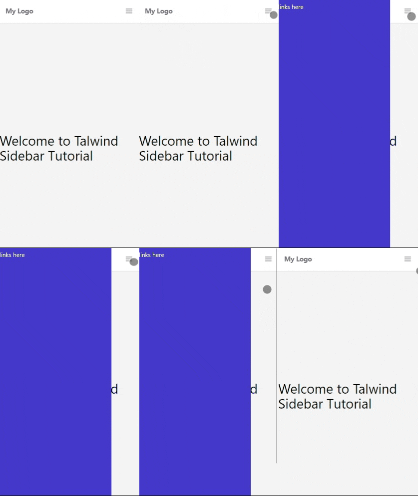
For mobile, the clicking on menu button now works:
Step 5 - Adding click-outside behavior #
Next, we'll add click-outside behavior so that the sidebar closes when you click outside of it.
// components/layout/Sidebar.tsx import React, { useRef } from "react"; import classNames from "classnames"; import { useOnClickOutside } from "usehooks-ts"; type Props = { open: boolean; setOpen(open: boolean): void; }; const Sidebar = ({ open, setOpen }: Props) => { const ref = useRef<HTMLDivElement>(null); useOnClickOutside(ref, (e) => { setOpen(false); }); return ( <div className={classNames({ // ... ommitted for brevity })} ref={ref} > <nav className="md:sticky top-0 md:top-16"> {/* nav items */} <ul className="py-2 flex flex-col gap-2"> <li>Nav items</li> </ul> </nav> </div> ); }; export default Sidebar;123456789101112131415161718192021222324252627282930
Explanation:
Line 4: We import the useOnClickOutside hook by usehooks-ts.
Lines 10-13: We define a ref that specifies the element boundary, and we add the handler to hide the sidebar.
Line 19: We attach the ref to the root sidebar div.
Step 6 - Decorating the Sidebar component #
Now we can add the navigation items and decorate the sidebar since we're done with the core functionality. Here's the full code for the sidebar:
// components/layout/Sidebar.tsx
import React, { useRef } from "react";
import classNames from "classnames";
import Link from "next/link";
import Image from "next/image";
import { defaultNavItems } from "./defaultNavItems";
import { useOnClickOutside } from "usehooks-ts";
// define a NavItem prop
export type NavItem = {
  label: string;
  href: string;
  icon: React.ReactNode;
};
// add NavItem prop to component prop
type Props = {
  open: boolean;
  navItems?: NavItem[];
  setOpen(open: boolean): void;
};
const Sidebar = ({ open, navItems = defaultNavItems, setOpen }: Props) => {
  const ref = useRef<HTMLDivElement>(null);
  useOnClickOutside(ref, (e) => {
    setOpen(false);
  });
  return (
    <div
      className={classNames({
        "flex flex-col justify-between": true, // layout
        "bg-indigo-700 text-zinc-50": true, // colors
        "md:w-full md:sticky md:top-16 md:z-0 top-0 z-20 fixed": true, // positioning
        "md:h-[calc(100vh_-_64px)] h-full w-[300px]": true, // for height and width
        "transition-transform .3s ease-in-out md:-translate-x-0": true, //animations
        "-translate-x-full ": !open, //hide sidebar to the left when closed
      })}
      ref={ref}
    >

      <nav className="md:sticky top-0 md:top-16">
        {/* nav items */}
        <ul className="py-2 flex flex-col gap-2">
          {navItems.map((item, index) => {
            return (
              <Link key={index} href={item.href}>
                <li
                  className={classNames({
                    "text-indigo-100 hover:bg-indigo-900": true, //colors
                    "flex gap-4 items-center ": true, //layout
                    "transition-colors duration-300": true, //animation
                    "rounded-md p-2 mx-2": true, //self style
                  })}
                >
                  {item.icon} {item.label}
                </li>
              </Link>
            );
          })}
        </ul>
      </nav>
      {/* account  */}
      <div className="border-t border-t-indigo-800 p-4">
        <div className="flex gap-4 items-center">
          <Image
            src={
              "https://images.unsplash.com/photo-1472099645785-5658abf4ff4e?ixlib=rb-1.2.1&ixid=eyJhcHBfaWQiOjEyMDd9&auto=format&fit=facearea&facepad=2&w=256&h=256&q=80"
            }
            height={36}
            width={36}
            alt="profile image"
            className="rounded-full"
          />
          <div className="flex flex-col ">
            <span className="text-indigo-50 my-0">Tom Cook</span>
            <Link href="/" className="text-indigo-200 text-sm">
              View Profile
            </Link>
          </div>
        </div>
      </div>
    </div>
  );
};
export default Sidebar;12345678910111213141516171819202122232425262728293031323334353637383940414243444546474849505152535455565758596061626364656667686970717273747576777879808182
For the navigation items, create the file components/layout/defaultNavItems.tsx and copy the following code:
// components/layout/defaultNavItems.tsx import React from "react"; import { CalendarIcon, FolderIcon, HomeIcon, UserGroupIcon, } from "@heroicons/react/24/outline"; import { NavItem } from "./Sidebar"; export const defaultNavItems: NavItem[] = [ { label: "Dashboard", href: "/", icon: <HomeIcon className="w-6 h-6" />, }, { label: "Team", href: "/team", icon: <UserGroupIcon className="w-6 h-6" />, }, { label: "Projects", href: "/projects", icon: <FolderIcon className="w-6 h-6" />, }, { label: "Calendar", href: "/calendar", icon: <CalendarIcon className="w-6 h-6" />, }, ];1234567891011121314151617181920212223242526272829303132
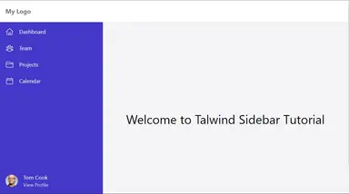
After this step you'll get the beautiful sidebar component:
That's basically it!
Full Code and Demo #
If you'd like to get the full code, it's available on GitHub: https://github.com/jmarioste/next-responsive-sidebar-tailwind
The demo is available on Stackblitz: NextJS Responsive Tailwind Sidebar Tutorial
Conclusion #
We learned how to create a beautiful responsive sidebar from scratch using tailwind CSS in NextJS. I think learning how to create components from scratch is a really good exercise for every developer.
In my opinion, I think using TailwindCSS is like a cheat code that allows you to add responsive styling to components at will. This is really hard to do in other CSS solutions like plain CSS, SCSS, styled-components, or opinionated libraries like bootstrap.
If you like this tutorial, please leave a like or share this article. For future tutorials like this, please subscribe to our newsletter or follow me on Twitter.
Credits: Image by Alexandru Manole from Pixabay


