How to Implement NextJS Form Validation with Formik and Zod

Jasser Mark Arioste

Hello, hustlers! In this tutorial, you'll learn how to implement client-side form validation in NextJS using the popular form-state management library Formik and the awesome schema validation library, Zod.
Sometimes, form validation can be complicated. This is especially true if you have so many input elements on the page/form and one input element depends on the input of another element. Couple this with the task of providing correct error messages of each input, handling loading states, handling touched states, etc.
It can very easily become complicated if we're not using tools and libraries. This is where formik and zod comes into play.
What is Formik? #
Formik is a very popular, open-source, form-state management library in React so that you can focus on building the form and not managing the states.
What is Zod? #
Zod is an open-source, type-first schema validation library written in typescript.
It can be used on both the client-side and server-side. If you have a very simple form (1-3 input fields only) that doesn't need much client-side validation, you can skip using formik and use Zod to validate the request server-side.
Tutorial Objectives #
In this tutorial, I'll provide an example of client-side form validation. We'll create a simple contact form that needs client-side validation.
Note that this is only for brevity, in real-world applications, you might not need client-side validation on such a simple form.
Final Output #
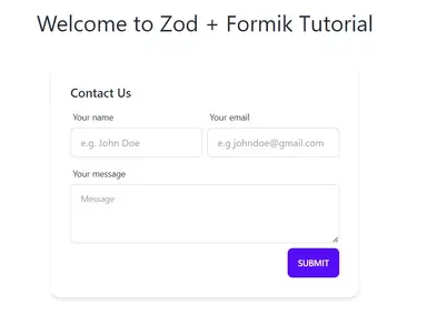
Here's the final output of what we'll be making today:

Step 0 - Project Setup #
Let's start with the project setup. For this tutorial, we're going to start from scratch. I'll be using DaisyUI for easy styling just as a personal preference.
You can simply skip this step but if you want to follow along, I already created a NextJS starter template in Github to easily bootstrap the project. Let's run the following command to create a new NextJS Project:
npx create-next-app -e https://github.com/jmarioste/next-daisyui-starter-plain nextjs-form-validationAfter everything is installed, run the following commands to start the local dev server:
cd nextjs-form-validation
yarn dev
Step 1 - Installing Dependencies #
Next, let's install the core dependencies which are zod and formik.
yarn add zod formikStep 2 - Creating the <ContactForm/> Component
#
Next, let's create a simple <ContactForm/> component without any validation. First, create the file components/ContactForm.tsx and copy the code below. Note that this uses daisyUI + tailwindCSS classes:
//components/ContactForm.tsx import React from "react"; const ContactForm = () => { return ( <div className="card shadow-md"> <form className="card-body"> <div className="card-title">Contact Us</div> <div className="flex space-between gap-2"> <div className="form-control w-full max-w-xs"> <label className="label"> <span className="label-text">Your name</span> </label> <input type="text" name="name" placeholder="e.g. John Doe" className="input input-bordered w-full max-w-xs" /> </div> <div className="form-control w-full max-w-xs"> <label className="label"> <span className="label-text">Your email</span> </label> <input type="text" name="email" placeholder="e.g johndoe@gmail.com" className="input input-bordered w-full max-w-xs" /> </div> </div> <div className="form-control"> <label className="label"> <span className="label-text">Your message</span> </label> <textarea className="textarea textarea-bordered h-24" placeholder="Message" ></textarea> </div> <div className="card-actions justify-end"> <button className="btn btn-primary" type="submit">Submit</button> </div> </form> </div> ); }; export default ContactForm;1234567891011121314151617181920212223242526272829303132333435363738394041424344454647484950
Explanation:
We use the card classes from daisyUI to give shape to the form. We use form-control and input classes to style the input elements and give them appropriate labels.
To use the ContactForm component we simply invoke it like so:
// pages/index.tsx import ContactForm from "components/ContactForm"; import { NextPage } from "next"; import React from "react"; const HomePage: NextPage = () => { return ( <div className="container"> <div className="grid place-content-center min-h-screen"> <div className="flex flex-col items-center gap-4"> <h1 className="text-4xl my-8">Welcome to Zod + Formik Tutorial</h1> <ContactForm /> </div> </div> </div> ); }; export default HomePage;12345678910111213141516171819
This gives us a simple but beautiful contact form.

This is what I like about daisyUI and TailwindCSS. Granted, there are a lot of code duplications for now but you can easily fix them by refactoring the duplicate code into components.
Step 3 - Adding Client-Side Validation #
Next, we'll add some client-side form validation using Zod and formik. First, let's create a validation schema. This will define the constraints of our form fields.
// components/ContactForm.tsx
import { object, string } from "zod";
..
const contactFormSchema = object({
  // defines a required field called name
  name: string({
    required_error: "Please enter your name",
  }),
  // defines a required field called email.
  // we use the built-in email validator from zod
  email: string().email("Please enter a valid email"),
  // defines a required field called message with length constraints of 150-1000 characters.
  message: string().min(150).max(1000),
});
...123456789101112131415
Next, let's install a super helpful helper library: zod-formik-adapter. This allows formik to use the contactFormSchema and validate our fields against it.
yarn add zod-formik-adapter1
Next, we'll transform our simple contact form to use Formik components.
// components/ContactForm.tsx import { Formik, Form, Field } from "formik"; import React from "react"; // ... // Get the infered input type from the schema using TypeOf type ContactFormInputs = TypeOf<typeof contactFormSchema> const ContactForm = () => { return ( <Formik<ContactFormInputs> initialValues={{ name: "", email: "", message: "", }} onSubmit={(values) => { // call api console.log("Form is submitted"); }} validationSchema={toFormikValidationSchema(contactFormSchema)} > <div className="card shadow-md"> <Form className="card-body"> <div className="card-title">Contact Us</div> <div className="flex space-between gap-2"> <div className="form-control w-full max-w-xs"> <label className="label"> <span className="label-text">Your name</span> </label> {/* use the Field component instead of input we leave all props as is */} {/* note that the name property should match the formik initialValues */} <Field type="text" name="name" placeholder="e.g. John Doe" className="input input-bordered w-full max-w-xs" /> </div> <div className="form-control w-full max-w-xs"> <label className="label"> <span className="label-text">Your email</span> </label> {/* use the Field component instead of input we leave all props as is */} {/* note that the name property should match the formik initialValues */} <Field type="text" name="email" placeholder="e.g johndoe@gmail.com" className="input input-bordered w-full max-w-xs" /> </div> </div> <div className="form-control"> <label className="label"> <span className="label-text">Your message</span> </label> {/* use as property to transform the field into a textarea */} <Field as="textarea" type="text" name="message" className="textarea textarea-bordered h-24" placeholder="Message" /> </div> <div className="card-actions justify-end"> <button className="btn btn-primary" type="submit">Submit</button> </div> </Form> </div> </Formik> ); }; export default ContactForm;12345678910111213141516171819202122232425262728293031323334353637383940414243444546474849505152535455565758596061626364656667686970717273747576
Explanation:
Line 23, we wrap everything in a <Formik/> provider component. We're saying that everything inside it belongs to this context. We can use hooks inside components and it can show us the correct state.
We use a generic type ContactFormInputs, which was derived from our schema using the TypeOf helper. This will ensure type-safety when using the <Formik/> provider.
Line 24-27: We define the initial values for the form. In this case, it is empty.
Line 33: We assign Formik a validation schema. we use the toFormikValidationSchema function by zod-formik-adapter to adapt into our form.
Lines 46,58, and 71: We use the formik <Field/> component and assign it the corresponding name prop from our initial values. The name field makes sure that our Formik will be able to handle or manage these fields.
Note that there are other ways of doing this, I'm only showing you the simplest method for tutorial purposes. If you need complicated input components for your form, you can always check the formik documentation.
Step 4 - Displaying error messages for each Field #
Right now when we try to click "Submit", nothing happens. The onSubmit callback doesn't even print logs to the console. This is because the onSubmit is only called when the form is valid. In this case, we have error messages in our <Formik/> state.
To display the errors, we need to have access to our Formik state. One way to do it is to use renderProps. Let's wrap our div.card element in a function:
// components/ContactForm.tsx

const ContactForm = () => {
  return (
    <Formik<ContactFormInputs>
      initialValues={{
        name: "",
        email: "",
        message: "",
      }}
      onSubmit={(values) => {
        // call api
        console.log("Form is submitted");
      }}
      validationSchema={toFormikValidationSchema(contactFormSchema)}
    >
      {(formikState) => {
        // get errors from formik
        const errors = formikState.errors;
        return (
          <div className="card shadow-md">
            {/*... */}
          </div>
        );
      }}
    </Formik>
  );
};12345678910111213141516171819202122232425262728
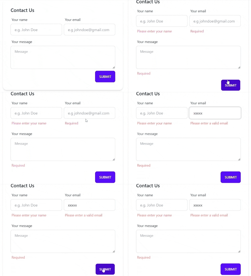
Now that we have access to errors object, we can simply use it to display the errors for each field like so:
<div className="form-control w-full max-w-xs">
  <label className="label">
    <span className="label-text">Your name</span>
  </label>
  <Field
    type="text"
    name="name"
    placeholder="e.g. John Doe"
    className="input input-bordered w-full max-w-xs"
  />
  {!!errors.name && (
    <label className="label">
      <span className="label-text text-error">
        {errors.name}
      </span>
    </label>
  )}
</div>123456789101112131415161718
The errors object has the same properties as our initial input: name, email and message. On your own, add errors for the other fields as well.
The output should be like this:

That's pretty much it!
Full Code and Demo #
The full code is available on GitHub: jmarioste/nextjs-form-validation
The demo is available on Stackblitz: NextJS Form Validation
Conclusion #
Formik and zod are tools to easily manage our forms without too much effort to that we can focus on building the form. There are still many things we can do with both of these packages, we've only scratched the surface.
If you like this tutorial, please leave a like or share this article. For future tutorials like this, please subscribe to our newsletter or follow me on Twitter.
Resources #
Credits: Image by Reiner from Pixabay


