How to Create a Responsive Collapsible Sidebar in React/NextJS using TailwindCSS

Jasser Mark Arioste

Hello, hustlers! Implementing layout can sometimes be tricky, especially when you're implementing multiple behaviors for a sidebar component. I was studying how to implement sidebars from scratch using tailwind and I thought it would be a good idea to share it here.
In this tutorial, you'll learn how to create a responsive and collapsible sidebar layout step-by-step by using and extending TailwindCSS grid classes.
Final Output: #
First, let me show you the final outputs on desktop and moble:
Desktop
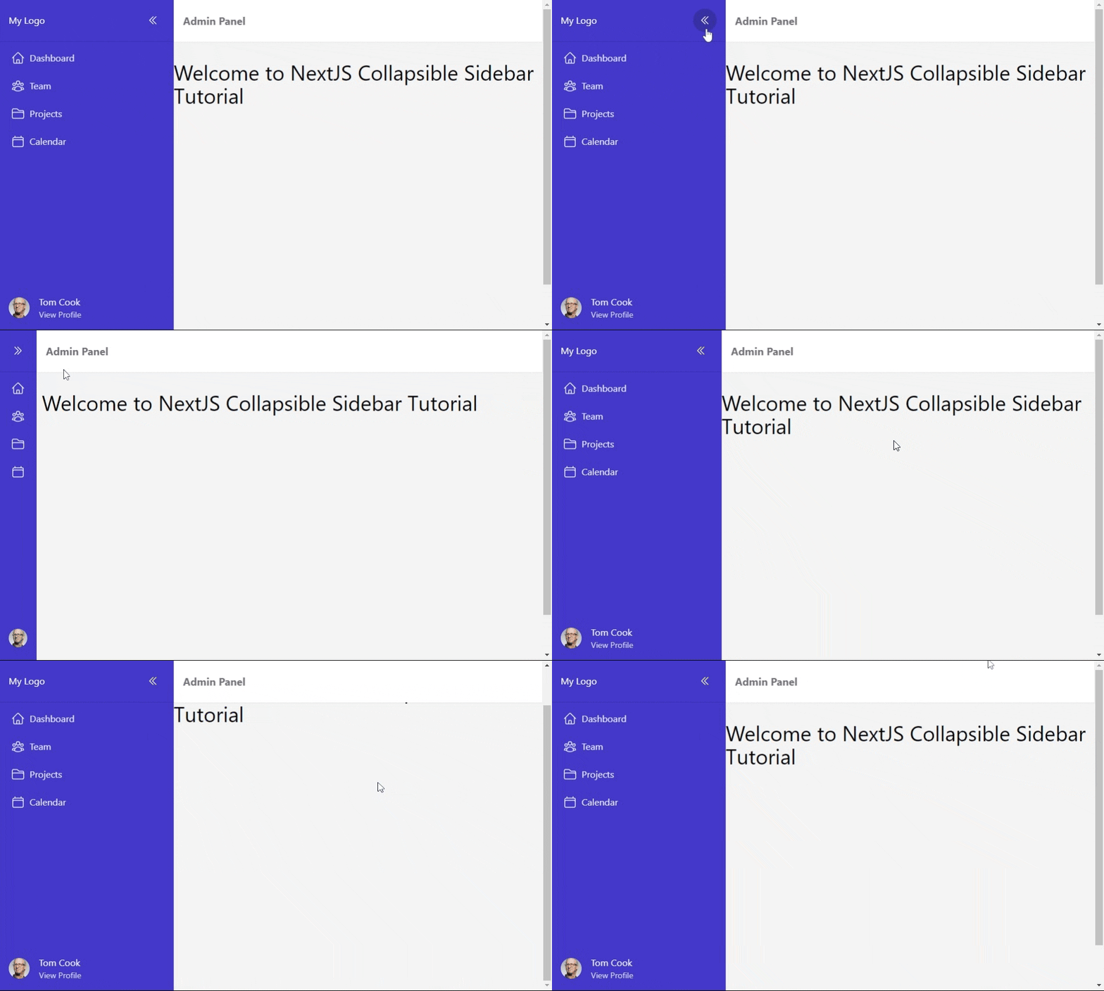
Mobile

Tutorial Objectives: #
- Learn how to create a collapsible react sidebar from scratch using Tailwind CSS in a NextJS Project. (Note: if you're using create-react-app or similar, just be sure to install TailwindCSS beforehand. This is not included in the scope of this tutorial).
- Use the
/pagesfolder directory in NextJS. We won't be using Next13's/appfolder since it's still in beta at the time of this writing. - Use React version 18.x and NextJS version 13.x with Typescript
Step 0: Project Setup #
To skip the lengthy process of installing TailwindCSS and dependencies. I created a starter template that includes Tailwind CSS pre-installed. If you're using an existing project, make sure to install TailwindCSS in NextJS.
Run the following command to create a new NextJS project using the starter template:
npx create-next-app -e https://github.com/jmarioste/next-tailwind-starter-2Also, don't forget to install the TailwindCSS VSCode extension to get the intellisense going.
Step 1: Installing Dependencies #
We're going to install the heroicons package for the navigation icons, and the classnames package to easily manage the tailwind classes. Run the command to install both packages at once:
yarn add @heroicons/react classnamesThe classnames package is a small library that allows us to easily organize and toggle classes depending on the application state. It also makes the code a lot more readable. I highly recommend using it when using TailwindCSS.
Step 2: Extending Tailwind Classes #
In this tutorial, we're going to use 300px as the width of the sidebar and 64px when collapsed. The grid-cols-* classes do not have a specific class for that so we're going to add it in tailwind.config.js:
/** @type {import('tailwindcss').Config} */
module.exports = {
  content: [
    "./app/**/*.{js,ts,jsx,tsx}",
    "./pages/**/*.{js,ts,jsx,tsx}",
    "./components/**/*.{js,ts,jsx,tsx}",
  ],
  theme: {
    extend: {
      gridTemplateColumns: {
        sidebar: "300px auto", //for sidebar layout
        "sidebar-collapsed": "64px auto", //for collapsed sidebar layout
      },
    },
  },
};12345678910111213141516
Now we get two additional classes (grid-cols-sidebar and grid-cols-sidebar-collapsed) from tailwind that easily splits the screen into two parts with the exact widths that we want. We'll use this when creating the layout component in the next step.
Step 3: Creating The <Layout/> Component
#
Next, let's create the Layout component and add it to _app.tsx
Create the file components/Layout.tsx and copy the code below:
// components/Layout.tsx
import classNames from "classnames";
import React, { PropsWithChildren, useState } from "react";
import { Bars3Icon } from "@heroicons/react/24/outline";
const Layout = (props: PropsWithChildren) => {
  const [collapsed, setSidebarCollapsed] = useState(false);
  return (
    <div
      className={classNames({
        // 👇 use grid layout
        "grid min-h-screen": true,
        // 👇 toggle the width of the sidebar depending on the state
        "grid-cols-sidebar": !collapsed,
        "grid-cols-sidebar-collapsed": collapsed,
        // 👇 transition animation classes
        "transition-[grid-template-columns] duration-300 ease-in-out": true,
      })}
    >
      {/* sidebar */}
      <div className="bg-indigo-700 text-white">
        <button onClick={() => setSidebarCollapsed((prev) => !prev)}>
          <Bars3Icon className="w-10 h-10" />
        </button>
      </div>
      {/* content */}
      <div className=""> {props.children}</div>
    </div>
  );
};
export default Layout;123456789101112131415161718192021222324252627282930
Explanation:
We use grid layout and grid-cols-* classes to modify the width of our sidebar.
We use transition classes to add a simple smooth animation.
We use the collapsed state to toggle the width of our sidebar.
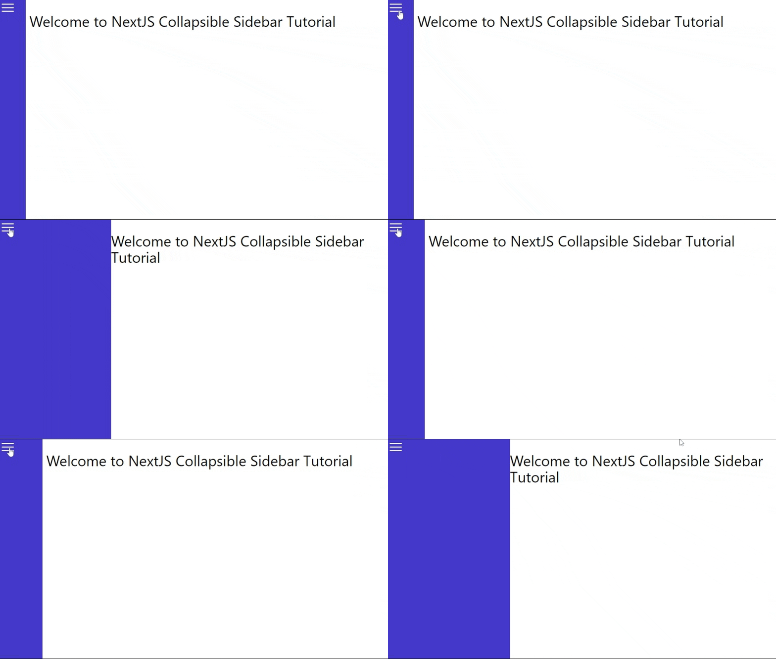
Output after this step:
Step 4: Creating the Sidebar Component #
Now that our layout is done, we just have to fill the sidebar component on the left. The sidebar is composed of 3 parts: The logo, the navigation items, and the user profile.
First, create the file components/Sidebar.tsx.
Step 4.1: Creating the Logo Part
The logo part consists of the logo and the button to control the sidebar. Examine the code with comments below. If you're not familiar with the class, you can always refer to the tailwind docs.
// components/Sidebar.tsx import React from "react"; import cn from "classnames"; import { ChevronDoubleLeftIcon, ChevronDoubleRightIcon, } from "@heroicons/react/24/outline"; // 👇 props to get and set the collapsed state from parent component type Props = { collapsed: boolean; setCollapsed(collapsed: boolean): void; }; const Sidebar = ({ collapsed, setCollapsed }: Props) => { // 👇 use the correct icon depending on the state. const Icon = collapsed ? ChevronDoubleRightIcon : ChevronDoubleLeftIcon; return ( <div className={cn({ "bg-indigo-700 text-zinc-50 z-20": true, })} > <div className={cn({ "flex flex-col justify-between": true, })} > {/* logo and collapse button */} <div className={cn({ "flex items-center border-b border-b-indigo-800": true, "p-4 justify-between": !collapsed, "py-4 justify-center": collapsed, })} > {!collapsed && <span className="whitespace-nowrap">My Logo</span>} <button className={cn({ "grid place-content-center": true, // position "hover:bg-indigo-800 ": true, // colors "w-10 h-10 rounded-full": true, // shape })} // 👇 set the collapsed state on click onClick={() => setCollapsed(!collapsed)} > <Icon className="w-5 h-5" /> </button> </div> </div> </div> ); }; export default Sidebar;12345678910111213141516171819202122232425262728293031323334353637383940414243444546474849505152
Next, is to modify Layout.tsx and use the Sidebar component:
// components/Layout.tsx import classNames from "classnames"; import React, { PropsWithChildren, useState } from "react"; import Sidebar from "./Sidebar"; const Layout = (props: PropsWithChildren) => { const [collapsed, setSidebarCollapsed] = useState(false); return ( <div className={classNames({ // ...omitted for brevity })} > {/* sidebar */} <Sidebar collapsed={collapsed} setCollapsed={() => setSidebarCollapsed((prev) => !prev)} /> {/* content */} <div className=""> {props.children}</div> </div> ); }; export default Layout;1234567891011121314151617181920212223
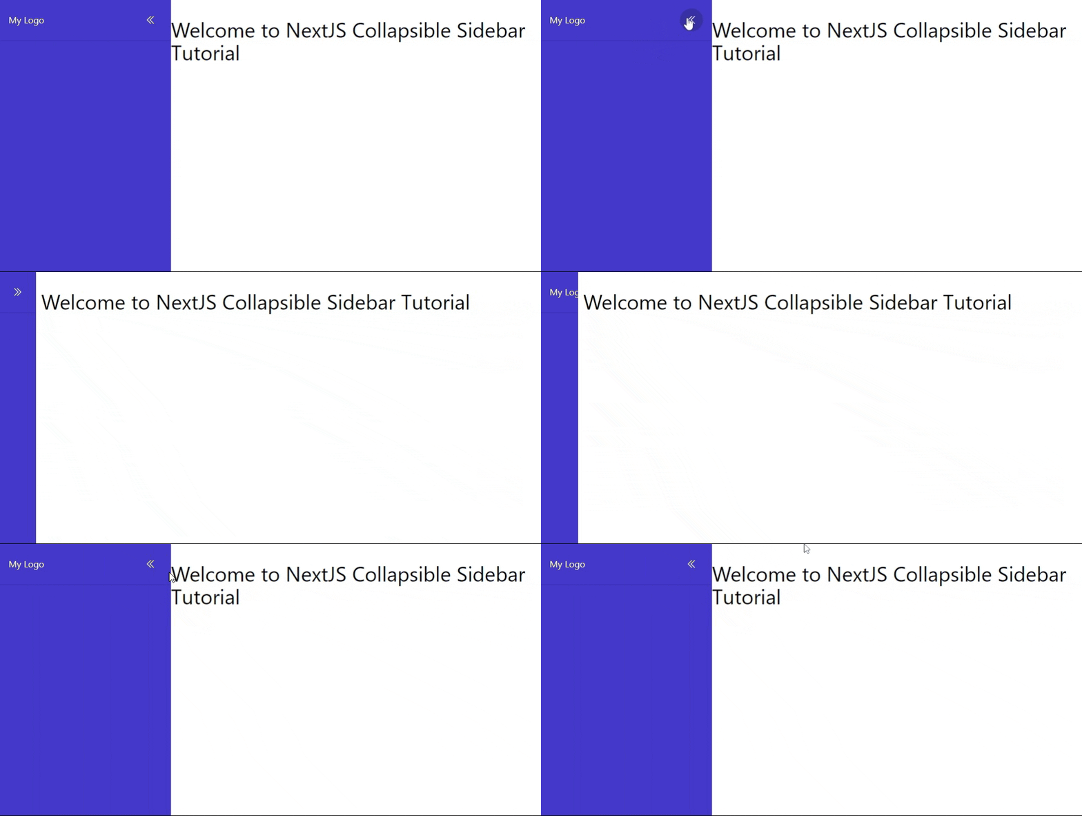
After this step, you get this result. Not bad, looks good already:
Step 4.2: Creating the Profile Part
At this point, we've gone through the important parts for this component. So you can actually skip this step and proceed to Step 5. You can still access the full code on GitHub.
If you want to follow along, add the following code to your Sidebar.tsx. I've highlighted the modified lines :
import React from "react"; import cn from "classnames"; import { ChevronDoubleLeftIcon, ChevronDoubleRightIcon, } from "@heroicons/react/24/outline"; import Image from "next/image"; import Link from "next/link"; // 👇 props to get and set the collapsed state from parent component type Props = { collapsed: boolean; setCollapsed(collapsed: boolean): void; }; const Sidebar = ({ collapsed, setCollapsed }: Props) => { // 👇 use the correct icon depending on the state. const Icon = collapsed ? ChevronDoubleRightIcon : ChevronDoubleLeftIcon; return ( <div className={cn({ "bg-indigo-700 text-zinc-50 z-20": true, })} > <div className={cn({ "flex flex-col justify-between": true, "h-full": true, })} > {/* logo and collapse button */} ... <div className={cn({ "grid place-content-stretch p-4": true, })} > <div className="flex gap-4 items-center h-11 overflow-hidden"> <Image src={"https://via.placeholder.com/150"} height={36} width={36} alt="profile image" className="rounded-full" /> {!collapsed && ( <div className="flex flex-col"> <span className="text-indigo-50 my-0">Tom Cook</span> <Link href="/" className="text-indigo-200 text-sm"> View Profile </Link> </div> )} </div> </div> </div> </div> ); }; export default Sidebar;12345678910111213141516171819202122232425262728293031323334353637383940414243444546474849505152535455565758
Step 4.3 Adding the Navigation Items Part
Next, lets create the navigation items part. Let's create the data by first creating the file components/defaultNavItems.tsx:
// components/defaultNavItems.tsx
import React from "react";
import {
  CalendarIcon,
  FolderIcon,
  HomeIcon,
  UserGroupIcon,
} from "@heroicons/react/24/outline";
// define a NavItem prop
export type NavItem = {
  label: string;
  href: string;
  icon: React.ReactNode;
};
export const defaultNavItems: NavItem[] = [
  {
    label: "Dashboard",
    href: "/",
    icon: <HomeIcon className="w-6 h-6" />,
  },
  {
    label: "Team",
    href: "/team",
    icon: <UserGroupIcon className="w-6 h-6" />,
  },
  {
    label: "Projects",
    href: "/projects",
    icon: <FolderIcon className="w-6 h-6" />,
  },
  {
    label: "Calendar",
    href: "/calendar",
    icon: <CalendarIcon className="w-6 h-6" />,
  },
];123456789101112131415161718192021222324252627282930313233343536
Next, let's modify our sidebar component to use these items. I've also highlighted the modified lines, note that some code are omitted for brevity:
// components/Sidebar.tsx ... import { defaultNavItems, NavItem } from "./defaultNavItems"; // add NavItem prop to component prop type Props = { collapsed: boolean; navItems?: NavItem[]; setCollapsed(collapsed: boolean): void; }; const Sidebar = ({ collapsed, navItems = defaultNavItems, setCollapsed, }: Props) => { const Icon = collapsed ? ChevronDoubleRightIcon : ChevronDoubleLeftIcon; return ( <div className={classNames({ "bg-indigo-700 text-zinc-50 z-20": true, "transition-all duration-300 ease-in-out": true, })} > <div className={classNames({ "flex flex-col justify-between ": true, "h-full": true, })} > {/* logo and collapse button */} {/* ...ommitted for brevity */} {/* nav items part */} <nav className="flex-grow"> <ul className={classNames({ "my-2 flex flex-col gap-2 items-stretch": true, })} > {navItems.map((item, index) => { return ( <li key={index} className={classNames({ "text-indigo-100 hover:bg-indigo-900 flex": true, //colors "transition-colors duration-300": true, //animation "rounded-md p-2 mx-3 gap-4 ": !collapsed, "rounded-full p-2 mx-3 w-10 h-10": collapsed, })} > <Link href={item.href} className="flex gap-2"> {item.icon} <span>{!collapsed && item.label}</span> </Link> </li> ); })} </ul> </nav> {/* profile part ...omitted for brevity */} </div> </div> ); }; export default Sidebar;1234567891011121314151617181920212223242526272829303132333435363738394041424344454647484950515253545556575859606162
Explanation:
We use flex-grow so that it takes up the most height. Then, we iterate through the navItems and use the corresponding styles that you want.
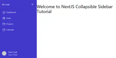
After this step, we've completed the sidebar but we still need to add responsive styles to make it look good on mobile.
Step 5: Creating Navbar Component #
Next, let's create a Navbar component that can hide or show the sidebar on mobile screens. Create the file components/Navbar.tsx:
// components/Navbar.tsx import React from "react"; import { Bars3Icon } from "@heroicons/react/24/outline"; import classNames from "classnames"; type Props = { /** * Allows the parent component to modify the state when the * menu button is clicked. */ onMenuButtonClick(): void; }; const Navbar = (props: Props) => { return ( <nav className={classNames({ "bg-white text-zinc-500": true, // colors "flex items-center": true, // layout "w-screen md:w-full sticky z-10 px-4 shadow-sm h-[73px] top-0 ": true, //positioning & styling })} > <div className="font-bold text-lg">Admin Panel</div> <div className="flex-grow"></div> <button className="md:hidden" onClick={props.onMenuButtonClick}> <Bars3Icon className="h-6 w-6" /> </button> </nav> ); }; export default Navbar;1234567891011121314151617181920212223242526272829
Next, let's use it on Layout.tsx:
// components/Layout.tsx import classNames from "classnames"; import React, { PropsWithChildren, useState } from "react"; import Navbar from "./Navbar"; import Sidebar from "./Sidebar"; const Layout = (props: PropsWithChildren) => { const [collapsed, setSidebarCollapsed] = useState(false); const [showSidebar, setShowSidebar] = useState(true); return ( <div className={classNames({ "grid bg-zinc-100 min-h-screen": true, "grid-cols-sidebar": !collapsed, "grid-cols-sidebar-collapsed": collapsed, "transition-[grid-template-columns] duration-300 ease-in-out": true, })} > <Sidebar collapsed={collapsed} setCollapsed={setSidebarCollapsed} /> <div> <Navbar onMenuButtonClick={() => setShowSidebar((prev) => !prev)} /> {props.children} </div> </div> ); }; export default Layout;123456789101112131415161718192021222324252627
Explanation:
Line 8: We add another state showSidebar, to show or hide the sidebar.
Line 20: We toggle it when the menu button is clicked.
Step 6: Adding Show/Hide State to the <Sidebar/>
#
Next is to add responsiveness to our Sidebar component. We'll have to target some responsive breakpoint classes as well as the show hide state from the Layout component.
Since we already have show/hide state in the Layout component, lets pass it to our sidebar component as props. First modify the sidebar component to accept show/hide state. I've again highlighted the modified parts:
// components/Sidebar.tsx import React from "react"; import classNames from "classnames"; import Link from "next/link"; import Image from "next/image"; import { defaultNavItems, NavItem } from "./defaultNavItems"; import { ChevronDoubleLeftIcon, ChevronDoubleRightIcon, } from "@heroicons/react/24/outline"; // add NavItem prop to component prop type Props = { collapsed: boolean; navItems?: NavItem[]; setCollapsed(collapsed: boolean): void; shown: boolean; }; const Sidebar = ({ collapsed, navItems = defaultNavItems, shown, setCollapsed, }: Props) => { const Icon = collapsed ? ChevronDoubleRightIcon : ChevronDoubleLeftIcon; return ( <div className={classNames({ "bg-indigo-700 text-zinc-50 z-20": true, "transition-all duration-300 ease-in-out": true, "fixed md:static md:translate-x-0": true, "w-[300px]": !collapsed, "w-16": collapsed, "-translate-x-full": !shown, })} > {/* ... ommitted for brevity */} </div> ); }; export default Sidebar;1234567891011121314151617181920212223242526272829303132333435363738394041
Explanation:
Lines 16 and 21: We add the shown state to later control the position of the sidebar.
Line 30: We use the fixed position on mobile, and change it back to static on md breakpoint. And since it's static on md, we always reset it to the initial position using translate-x-0 regardless of the state.
Line 31-32: Since the position is fixed, we have to set the width since it's already out of the grid layout at this point.
Line 33: We hide it to the left when it's not shown using -translate-x-full.
If you're having trouble understanding these classes, it's best to read the documentation on tailwind. and see what the specific css does.
Next, let's modify Layout.tsx to pass the shown state:
// components/Layout.tsx import classNames from "classnames"; import React, { PropsWithChildren, useState } from "react"; import Navbar from "./Navbar"; import Sidebar from "./Sidebar"; const Layout = (props: PropsWithChildren) => { const [collapsed, setSidebarCollapsed] = useState(false); const [showSidebar, setShowSidebar] = useState(true); return ( <div className={classNames({ "grid bg-zinc-100 min-h-screen": true, "grid-cols-sidebar": !collapsed, "grid-cols-sidebar-collapsed": collapsed, "transition-[grid-template-columns] duration-300 ease-in-out": true, })} > <Sidebar collapsed={collapsed} setCollapsed={setSidebarCollapsed} shown={showSidebar} /> <div className=""> <Navbar onMenuButtonClick={() => setShowSidebar((prev) => !prev)} /> {props.children} </div> </div> ); }; export default Layout;123456789101112131415161718192021222324252627282930
That's it! After this step, you should have the same output as the final output above.
Full code and Demo #
The full code can be accessed at GitHub: Next Collapsible Sidebar Tailwind
The demo can be accessed at Stackblitz: Next Collapsible Sidebar Tailwind Demo
Conclusion #
We learned how to create a responsive collapsible sidebar from scratch just by using tailwind classes and a bit of react to handle the state. It's amazing how much control you have when using tailwind.
I think the main thing you need to think of when creating any component is, you have to have a plan. In this case, we started with a simple idea of using grid layout to control the width of the sidebar. We then added functionality later as we went on.
If you like this tutorial, please leave a like or share this article. For future tutorials like this, please subscribe to our newsletter or follow me on Twitter.


