How to Create a Sticky Sidebar with TailwindCSS

Jasser Mark Arioste

Hello, hustler! In this tutorial, you'll learn how to create a sticky sidebar using TailwindCSS classes. The sticky sidebar we're creating is similar to a blog website layout with a sidebar on the right or left.
Final Output #
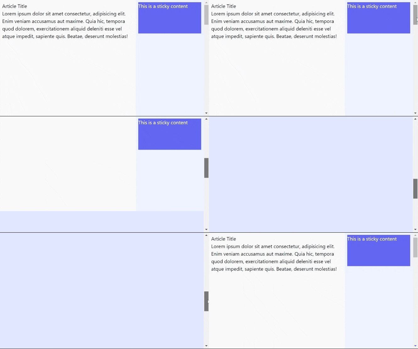
Here's the final output of what we'll be making today.

If you need a sidebar for navigation like an admin panel, I created a previous tutorial for that: How to Create a Responsive Tailwind Sidebar Layout in NextJS 12
Step 1 - Implementing the Correct Layout #
If we want to create the sticky sidebar correctly, first we'll have to implement the correct layout. Create a two-column layout without any sticky behavior for now as shown below:
export default function Home() { return ( <div className="min-h-screen flex flex-col"> <main className="container max-w-4xl mx-auto"> {/* Use a 12-column layout */} <div className="grid grid-cols-12"> {/* Main Content - uses 8-colspan*/} <div className="col-span-8 bg-gray-50 h-[2000px] p-2"> <h1>Article Title</h1> <p> Lorem ipsum dolor sit amet consectetur, adipisicing elit. Enim veniam accusamus aut maxime. Quia hic, tempora quod dolorem, exercitationem aliquid deleniti esse vel atque impedit, sapiente quis. Beatae, deserunt molestias! </p> </div> {/* Sidebar - uses 4 col span */} <div className="col-span-4 bg-indigo-50 p-2"> Sidebar</div> </div> </main> </div> ); }1234567891011121314151617181920212223
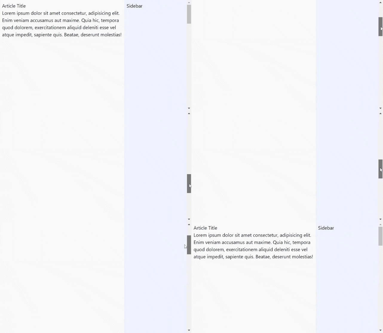
Explanation: We're using grid and grid-cols-12 classes to split the layout into 2 columns. For right now, we are just creating the layout without any sticky behavior.
NOTE: Here, I'm using React to render the output but you can convert the code to HTML by using class instead of className.
The output will be something like this:

Step 2 - Adding Sticky Content to the Sidebar Column #
Now that we have the correct layout implemented properly, we can now add any sticky content to the sidebar column. See the code below:
export default function Home() { return ( <div className="min-h-screen flex flex-col"> <main className="container max-w-4xl mx-auto"> {/* Use a 12-column layout */} <div className="grid grid-cols-12"> {/* Main Content - uses 8-colspan*/} <div className="col-span-8 bg-gray-50 h-[2000px] p-2"> <h1>Article Title</h1> <p> Lorem ipsum dolor sit amet consectetur, adipisicing elit. Enim veniam accusamus aut maxime. Quia hic, tempora quod dolorem, exercitationem aliquid deleniti esse vel atque impedit, sapiente quis. Beatae, deserunt molestias! </p> </div> {/* Sidebar - uses 4 col span */} <div className="col-span-4 bg-indigo-50 p-2"> <div className="sticky top-2 bg-indigo-500 text-white h-[100px]"> This is a sticky content </div> </div> </div> <div className="bg-indigo-100 h-[1000px] p-2"> Content for demo purposes</div> </main> </div> ); }12345678910111213141516171819202122232425262728
On line 20, we use the sticky and top-* classes. So that the sticky works properly. On line 24, I just added another piece of content for demo purposes.
After this step, you'll have the same output as our final output above.
Conclusion #
You learned how to create a tailwind sticky sidebar from scratch. One way to guarantee that it works correctly is by making sure that your layout is correct.
If you like this tutorial, please leave a like or share this article. For future tutorials like this, please subscribe to our newsletter or follow me on GitHub.
Resources #
To know more about the classes I used in this tutorial. Here are some quick links to the tailwind docs:
Credits: Image by Albrecht Fietz from Pixabay


